

Table of Contents
Architecture mood board creation is no longer a collage exercise — it is a precision communication protocol that determines whether a client approves your vision or walks away confused.
In Copenhagen’s recent wave of mixed-use urban housing projects — where adaptive reuse collides with Passive House standards and biophilic programming — design teams have reported that clients reject technically flawless schemes not because of the architecture, but because the presentation failed to translate material atmosphere into felt experience. The gap between what a designer conceives and what a client perceives is not a taste problem. It is a communication infrastructure problem. Architecture mood board creation, executed at a professional level, is the system that closes that gap.
Nuvira Perspective
At Nuvira Space, we operate at the intersection of human perception and machine-precision visualization. Our workflow does not treat mood boards as decorative warm-ups before the “real” technical deliverables. We treat architecture mood board creation as a high-fidelity simulation layer — a parallel track to parametric modeling, global illumination calibration, and ray-trace depth mapping — because the client’s emotional commitment to a project is secured long before construction documents are issued.
When you align a curated material palette with real-time rendered atmosphere references, you are not producing a mood board. You are producing a sensory contract. Our approach synthesizes post-production grading logic, real-world material reflectance data, and spatial narrative sequencing into every client-facing presentation we build. The result is a document that behaves less like a Pinterest board and more like a pre-visualization pipeline output — one that a client can inhabit mentally before a single foundation is poured.
Step-by-Step Workflow: Architecture Mood Board Creation for Client Presentations
Phase 1 — Spatial Concept Definition Before Image Collection
The single most common mistake in architecture mood board creation is starting with images. You must start with spatial intent.
Before opening Milanote, Adobe Express, Canva Pro, or any collection interface, define the following parameters in writing:
- Primary sensory register: Is this space about thermal mass and quiet weight (concrete, rammed earth), or about luminous transparency (low-iron glazing, white oak, bleached linen)?
- Occupant behavioral arc: How does a person move through the space — arrival sequence, compression point, release moment?
- Material hierarchy: Identify your dominant material (60%), secondary material (30%), and accent material (10%) before sourcing a single image.
- Lighting typology: Direct solar penetration, diffuse northern light, artificial supplemental layering, or a calibrated combination?
This verbal brief becomes your filter. Every image you collect either strengthens the argument or dilutes it.
Deliverable at Phase 1
A written spatial brief of no more than 150 words that any team member or client could read and immediately identify what the space should feel like — not what it looks like.
Phase 2 — Structured Image Collection Protocol
Now you collect. But you collect with discipline.
Image sourcing hierarchy for architecture mood board creation:
- Tier 1 — Proprietary renders and photographs: Your own project photography, renders from Lumion, Enscape, or D5 Render, or real-time viewport captures from Unreal Engine 5
- Tier 2 — Attributed precedent imagery: Published project photography with clear credits (Archdaily, Dezeen, World Architecture Festival archives)
- Tier 3 — Texture and material close-ups: Stone, timber, concrete, metal — macro photography of surfaces that establish tactile language
- Tier 4 — Atmospheric references: Landscape, weather, light conditions — images that carry emotional temperature rather than architectural specifics
Reject the following automatically:
- Any image with visible furniture logos or brand watermarks
- Stock photography with artificial lighting that reads as commercial photography rather than spatial photography
- Renders from competing firms that could confuse proprietary design intent
Quantity discipline: Collect no fewer than 40 images per board. Edit down to 12–18 final selections. The editing process is where your design judgment is visible — not the sourcing.
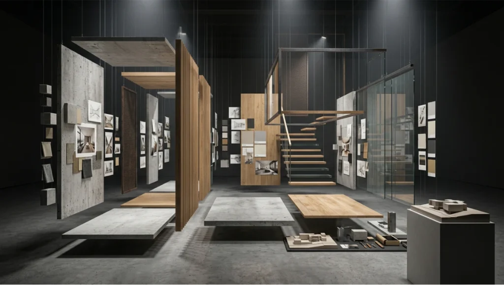
Phase 3 — Board Architecture and Compositional Logic
A mood board is a two-dimensional spatial composition. Apply the same design principles you use in plan and section.
Grid Framework Options
Option A — Asymmetric anchor layout: One dominant image (full left column or full top row) establishes the primary sensory register. Smaller images radiate from it in descending scale. Use this when your project has a single dominant material or spatial idea.
Option B — Triptych sequence: Three equal vertical columns that read left to right as a spatial journey — arrival, inhabitation, departure. Effective for residential and hospitality typologies where sequence matters.
Option C — Material dissection grid: A systematic grid that isolates each material family in its own zone. Most appropriate for technical client presentations where procurement decisions are attached to the board.
Color Field Construction
Do not source a color palette from a color picker tool after building the board. Extract your palette from the images themselves using Photoshop’s histogram or Adobe Color’s extraction tool. The palette must emerge from the materials, not be imposed on them.
Technical spec for color extraction:
- Sample minimum 5 dominant colors from your Tier 1 and Tier 3 images
- Establish Munhttps://en.wikipedia.org/wiki/Munsell_color_systemsell or RAL equivalents for any color you intend to specify in documentation
- Display swatches at minimum 80px × 80px — anything smaller loses legibility in printed presentations
Typography on the Board
Use typography sparingly and only for spatial classification, not description. Three rules:
- Project name: One typeface, one weight, one size — set at no larger than 14pt if the board is A3 or smaller
- Material labels: A single sans-serif at 8–9pt, set in gray not black, aligned to the material swatch it references
- No body copy on the board itself: If you need to explain what the board shows, the board has failed
Phase 4 — Post-Production Refinement
This is where architecture mood board creation diverges from interior decorating mood boards. You are not producing a collage. You are producing a cohesive visual argument.
Tone-matching workflow: Every image on your board must share a coherent luminance range. Use Photoshop Camera Raw or Lightroom to:
- Normalize white balance across all images (target a consistent color temperature: warm interior boards at 2700–3200K equivalent; cool exterior boards at 5500–6500K)
- Adjust exposure so no single image reads as significantly darker or lighter than its neighbors
- Apply a unified tonal curve — a subtle S-curve that adds micro-contrast without oversaturating
Material reflectance correction: If you are sourcing real-time render output alongside photography, correct for the inherent luminosity inflation in real-time engines. Enscape and Lumion tend to push ambient light levels approximately 15–20% above photographic equivalents. Bring render outputs down in exposure to match your photographic references before placing them on the board.
See also: AI Rendering Plugins for current tools that automate cross-source tone matching.
Phase 5 — Presentation Sequencing for Client Meetings
The board itself is one deliverable. How you deploy it in a client meeting is a separate discipline.
Sequencing protocol:
- Do not open with the mood board. Begin with a verbal brief — two to three sentences that establish the spatial concept without visual support. Let the client form a mental image first.
- Reveal the board as confirmation, not introduction. When you show the board, it should feel like validation of what they just imagined — not a surprise.
- Walk the board in a defined sequence. Use a laser pointer or cursor to guide attention. Do not let the client free-roam the board before you have anchored the primary sensory register.
- Close with the material palette. End at the swatches. This is where the conversation moves from atmosphere to decision — which is exactly where you want it.
For deeper presentation mechanics, the architectural photography composition principles that govern single-image framing apply equally to multi-image board sequencing.
Comparative Analysis: Nuvira Approach vs. Industry Standard
What Most Firms Do
The industry-standard approach to architecture mood board creation treats the board as a pre-design deliverable — something assembled quickly during concept phase to demonstrate directional thinking, then discarded once schematic design begins.
Typical legacy workflow:
- Designer pulls 10–15 images from Pinterest or Archdaily
- Images are dropped into a Canva template
- Board is sent as a PDF before the client meeting with no verbal briefing protocol
- Client provides vague feedback (“I like this but maybe a bit warmer?”)
- Designer iterates the board twice before losing alignment entirely
Problems this creates:
- No material hierarchy — the board reads as aesthetic sampling, not design argument
- No tone coherence — images from different lighting conditions and photographic styles create visual noise
- No presentation protocol — the client anchors on the wrong image and the conversation derails
- No connection to technical deliverables — the board lives in isolation from the drawings, specifications, and render pipeline
What Nuvira Does
| Parameter | Industry Standard | Nuvira Approach |
|---|---|---|
| Starting point | Image collection | Written spatial brief |
| Color sourcing | External palette tools | Extracted from materials |
| Tone coherence | None applied | Normalized via Camera Raw |
| Render integration | Rarely included | Tier 1 source priority |
| Presentation protocol | Board sent in advance | Verbal brief first, board as confirmation |
| Connection to specs | None | Material labels with Munsell/RAL refs |
| Iteration trigger | Client preference | Spatial brief compliance |
The difference is systematic. When architecture mood board creation is treated as a precision workflow rather than a creative warmup, client approval rates increase and revision cycles shorten — not because the boards are “prettier,” but because the communication is structurally sound.
Speculative / Internal Concept Study — “Havn Sequence” by Nuvira Space
Project Overview
Location: Copenhagen, Denmark — North Harbour (Nordhavn) district Typology: Mixed-use residential over ground-floor workspace, adaptive reuse of former industrial wharf infrastructure Vision: A 6,400 m² building that negotiates between the thermal mass logic of the existing concrete wharf shell and the luminous transparency required by northern European residential standards, where daylight hours contract to under 7 hours in December
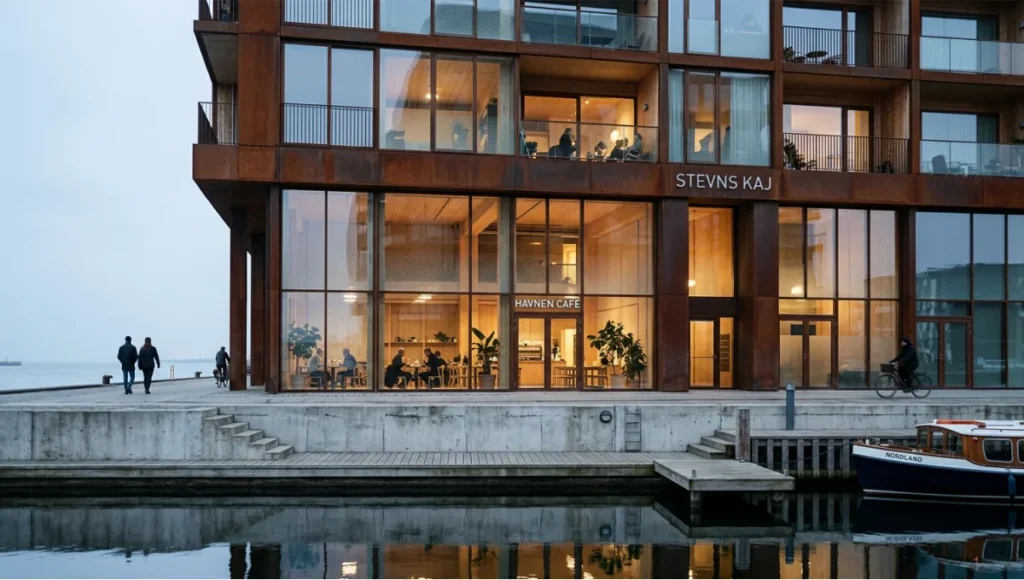
The Havn Sequence project was developed as an internal concept study to test our mood board creation methodology against a genuinely complex climatic and material brief — one where the board must communicate simultaneously to a developer client (ROI and marketability) and an end-user audience (spatial wellbeing and atmosphere).
Design Levers Applied
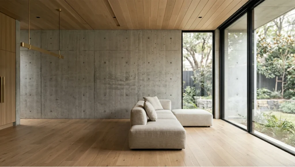
Material System
Primary material (60%): Patinated weathering steel — referencing the industrial heritage of the Nordhavn waterfront. On the board, represented through macro photography of aged Corten samples and precedent images from architectural photography of harbour-adjacent projects in Rotterdam and Hamburg.
Secondary material (30%): Exposed cross-laminated timber ceiling panels — warm counterpoint to steel and concrete. Board references sourced from our proprietary render library using cross-laminated timber vs. mass timber material studies.
Accent material (10%): Low-iron float glass with fritted ceramic dot pattern — modulates solar gain without full opacity. Referenced through close-up glass texture photography and luminance transmission test swatches.
Lighting Reference System
- Board color temperature: 3800K — a deliberate mid-point between the warmth of the timber interior and the cool northern harbor light exterior
- Luminance normalization: All board images processed through a unified Lightroom preset calibrated to Copenhagen’s diffuse overcast light conditions (average 12,000–18,000 lux exterior, 300–500 lux interior target)
- Render sources: Enscape outputs from the working model, corrected -18% exposure to match photographic references
Board Compositional Structure
- Asymmetric anchor layout: Full-height Corten surface photograph anchoring left column
- Triptych sequence in right panel: arrival at the wharf threshold / main living volume / rooftop workspace terrace
- Material dissection strip along the bottom margin: steel, CLT, glass — each labeled with Munsell equivalent and NCS code
Transferable Takeaway
The Havn Sequence board succeeded because it made one argument clearly: this building belongs to its harbor context without imitating it. Every image was selected to reinforce material authenticity over stylistic gesture. The client — a Copenhagen-based mixed-use developer — approved the scheme direction in a single meeting. No revision cycle required.
The transferable principle: your mood board should be able to make its argument without you in the room. If a colleague or client can look at the board for 30 seconds and accurately describe the spatial concept in their own words, the board is doing its job. If they need you to explain it, the board is not finished.
Intellectual Honesty: Hardware Check
Architecture mood board creation at the level described in this guide requires tools, and tools have costs.
Software minimum requirements for this workflow:
- Adobe Photoshop or Lightroom (current subscription) — for tone normalization and color extraction
- Adobe Illustrator or InDesign — for board layout with precise grid control
- Alternatively: Milanote Pro (USD 12.50/month) for cloud-based collaboration workflows
- Real-time render engine access for Tier 1 imagery: Enscape, Lumion, or D5 Render
Hardware minimum for render-integrated workflows:
- GPU: NVIDIA RTX 3080 or AMD equivalent — minimum for real-time ray tracing at presentation quality
- RAM: 32 GB minimum; 64 GB recommended for simultaneous Photoshop and render engine operation
- Monitor: Color-calibrated display (Delta-E < 2) is non-negotiable for tone-matching accuracy. A board that looks coherent on an uncalibrated monitor will fail when projected or printed.
See the full GPU for rendering 2026 guide for current hardware recommendations.
If you do not have access to this hardware configuration, the workflow is still executable — but your Tier 1 imagery will be limited, and your tone normalization will be less precise. Know your constraints and work within them honestly.
2030 Future Projection
The architecture mood board creation workflow of 2030 will be inseparable from AI architecture visualization and rendering pipelines. Here is what the trajectory indicates:
Real-time material simulation on board: By 2027–2028, clients will not view static boards. They will interact with parametric material systems — changing stone finish from honed to bush-hammered, shifting glass frit density, toggling timber grain direction — in real time during the presentation meeting itself. Tools like Generative AI in architecture are already pushing toward this.
Automated tone coherence: Machine learning models trained on architectural photography datasets will normalize tone across mixed-source image collections automatically — eliminating one of the most time-consuming steps in current workflow. Expect this capability in Adobe Firefly’s architecture-specific modules within 24–36 months.
Haptic material reference integration: Physical material samples will be linked digitally to their board representation via NFC or QR tags, allowing clients to touch a material swatch and immediately see its behavior modeled in the rendered spatial context. This bridges the physical-digital gap that remains the most significant limitation of screen-based presentations.
Environmental performance overlays: By 2030, a mature mood board will include embedded thermal and daylighting performance indicators tied to the material selections shown. Choosing a high-mass material palette will automatically surface passive cooling performance projections — connecting the passive cooling techniques embedded in the design intent to the atmospheric images on the board.
The direction is clear: architecture mood board creation is evolving from a static communication document into a live, responsive, performance-linked simulation environment.
Secret Techniques: Advanced User Guide
These are the non-obvious workflow decisions that separate competent mood boards from genuinely persuasive ones.
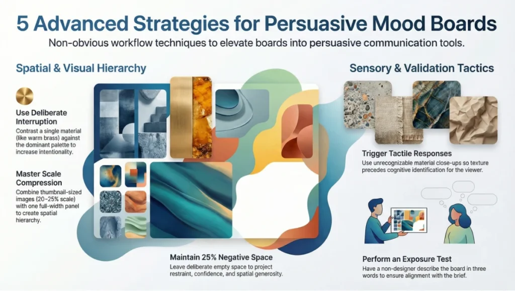
1. The deliberate interruption: Place one image on the board that slightly violates the dominant material language — a single warm brass detail in an otherwise cool concrete-and-steel board. This controlled dissonance makes the dominant palette feel more intentional by contrast. Clients read visual consistency better when it is briefly interrupted.
2. Scale compression: The most common board failure is uniform image sizing. Compress two or three images to thumbnail scale (20–25% of their natural prominence) and allow one image to breathe at full or near-full panel width. This creates the same spatial hierarchy you use in architectural section — compression and release.
3. The material close-up strategy: For every finish material on your board, include one image that is so close to the surface that the material is initially unrecognizable — where texture precedes identification. This triggers a tactile response in the viewer before the material is cognitively classified. It is the visual equivalent of running your hand along a wall before you look at it.
4. Negative space as a design move: Leave 20–25% of your board as deliberate white or neutral-toned empty space. Most designers fill every centimeter. Empty space communicates restraint, confidence, and spatial generosity — exactly the qualities you likely want your architecture to project.
5. The pre-meeting board exposure test: Before any client meeting, photograph your printed or screen-displayed board with your phone and send the image to someone outside the project — not a designer, not a colleague. Ask them to describe the space in three words. If their three words align with your spatial brief, the board works. If they describe something unrelated, recalibrate before the meeting.
Comprehensive Technical FAQ
Frequently Asked Questions: Architecture Mood Board Creation
Q: How many images should a professional architecture mood board contain?
A: For a single-phase concept presentation, 12–18 images is the professional standard. Fewer than 10 risks appearing underdeveloped; more than 22 creates visual competition between elements and dilutes the spatial argument. Boards for phased presentations — where you are covering multiple design directions — can extend to 30–36 images if each direction occupies a clearly demarcated zone.
Breakdown by category:
- Primary spatial references: 3–4 images
- Material close-ups: 4–6 images
- Atmospheric/lighting references: 3–4 images
- Color palette swatches: 5–8 extracted swatches
- Optional: 1–2 precedent project images (attributed)
Q: What software gives the most professional output for architecture mood board creation?
A: It depends on your distribution method and team structure:
- Adobe InDesign — highest precision for grid control, typography, and print-ready output. Steepest learning curve. Best for firms producing formal client deliverables.
- Adobe Photoshop — optimal for tone normalization and image compositing. Less suited to layout but ideal in combination with InDesign.
- Milanote — best for collaborative, cloud-based workflows where client participation in the collection phase is desired.
- Figma — increasingly used for digital-first presentations where the board will be shared as an interactive link rather than a static PDF.
Avoid: PowerPoint and Google Slides for primary board production. Both impose compression artifacts on exported imagery and offer insufficient grid control for precise compositional layout.
Q: Should renders from Enscape or Lumion be included on architecture mood boards at early concept stage?
A: Yes — with a critical caveat. Early-stage renders must be clearly labeled as conceptual visualization outputs, not design proposals. Clients routinely anchor on render details (a specific door handle, a visible furniture piece, a particular tree species) and treat them as design commitments. Label all renders with a visible “Conceptual Visualization — Subject to Design Development” tag.
Technical correction required: Real-time engines like Enscape and Lumion produce luminance levels that do not correspond to photographic reality. Before placing render output on a board alongside photography, apply a -15% to -20% exposure correction and match white balance to your photographic sources. Failure to do this creates a jarring tonal disconnect that signals technical carelessness to any experienced viewer.
Q: How do you handle client feedback that contradicts the spatial brief?
A: This is a workflow question, not a design question. When client feedback conflicts with the agreed spatial brief, you have two options:
Option A: Return to the brief and clarify whether the brief itself needs revision. If the client’s feedback reveals a genuine shift in project goals, update the brief first, then rebuild the board.
Option B: Identify whether the feedback is a response to the board’s execution rather than its concept. “I don’t like this — it feels cold” may mean the tone normalization was too cool, not that the material palette is wrong. Isolate execution failures from concept disagreements before responding.
Never iterate the board without first identifying which category the feedback belongs to.
Q: Is there an AIA-referenced standard for mood board presentation in architectural practice?
A: The American Institute of Architects (AIA) does not publish a specific standard for mood board format or content. However, the AIA’s guidelines on Design Phase Services (B101 Owner-Architect Agreement) and the documentation framework provided in the AIA Handbook of Professional Practice address client communication obligations during schematic design — the phase where mood boards typically serve their primary function. Firms operating under AIA contract structures should ensure mood boards are documented as schematic design deliverables and retained as part of the project record. Refer to the AIA’s Practice Management resources at aia.org/practice for current guidance on client communication documentation standards.
Q: How do you adapt architecture mood board creation for digital vs. physical client meetings?
A: The content discipline is identical. The delivery format differs significantly:
Digital presentation:
- Export as PDF at 300 DPI minimum; compress to under 10 MB for email distribution
- For screen presentation, export as a 1920×1080 or 2560×1440 PNG — never embed a low-resolution image in a slide deck
- Use Figma or Milanote for interactive link-based sharing where client annotation is desired
- Calibrate your monitor before screen-based presentations; an uncalibrated display will misrepresent material colors
Physical presentation:
- Print at A2 or A1 — smaller formats lose material texture legibility
- Use a matte finish print stock; glossy surfaces create distracting reflections in typical presentation room lighting
- Lamination is appropriate for repeated-use reference boards but changes surface character — test before printing the final deliverable
- Bring physical material samples to accompany the printed board wherever possible; tactile confirmation of a material reference closes the communication loop that a photograph cannot
Start Practicing These Principles Before Your Next Client Meeting
Architecture mood board creation is not a soft skill supplementing technical competence. It is a precision discipline that directly determines whether a client commits to a design direction with confidence or retreats into indecision. Every parameter covered in this guide — from spatial brief construction to tone normalization, from compositional hierarchy to presentation sequencing — has a measurable effect on client approval outcomes.
Your next client presentation is either going to be a sensory argument that they can inhabit mentally, or a collection of images that leaves interpretation to chance. The gap between those two outcomes is not talent. It is methodology.
Begin with the written spatial brief. End with a material palette that your client can specify. Build everything in between with the same discipline you apply to your technical documentation — because for your client, the mood board is the most important technical document you will ever produce.
For related Nuvira Space workflows on visualization and presentation production, explore our guides on VR architectural walkthroughs, architectural animation, and architectural collages — each representing a distinct layer in the client communication pipeline that feeds from and into architecture mood board creation.
© Nuvira Space. All rights reserved. | THE VISUAL LAB Series | All specifications cited are based on current industry-standard software documentation for Adobe Creative Suite, Enscape 4.x, Lumion 2024, D5 Render 2.x, and Milanote Pro, alongside AIA Practice Management Guidelines and publicly available architectural photography technical standards. The Havn Sequence is a speculative internal concept study and does not represent a completed project.