

Table of Contents
Poetcore interior design is no longer a decorating trend you browse for inspiration — it is a measurable shift in how your nervous system reads a room, and by 2026 it has become one of the most physiologically legible movements in residential architecture. You do not need to know a single line of verse to feel it: a poetcore room lowers your shoulders, slows your breath, and reorganizes your attention around texture, shadow, and the imperfect edge of a hand-finished surface. That is not sentiment. That is measurable nervous-system regulation, and it is why we are treating poetcore interior design as a case study in applied spatial psychology rather than as an aesthetic footnote.
Nuvira Perspective
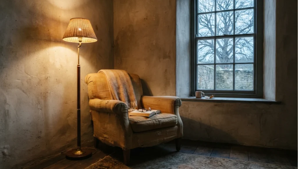
At Nuvira Space, we do not evaluate interiors as compositions of furniture and color. We evaluate them as instruments — systems that either regulate or dysregulate the body that lives inside them. Poetcore interior design sits at an unusually interesting intersection for us, because it is one of the few trend movements built almost entirely around biological cues rather than status cues: worn linen instead of polish, low and warm light instead of even illumination, irregular plaster instead of seamless drywall. These are not stylistic preferences. They are sensory inputs your limbic system has been reading as “safe” for longer than any style has existed.
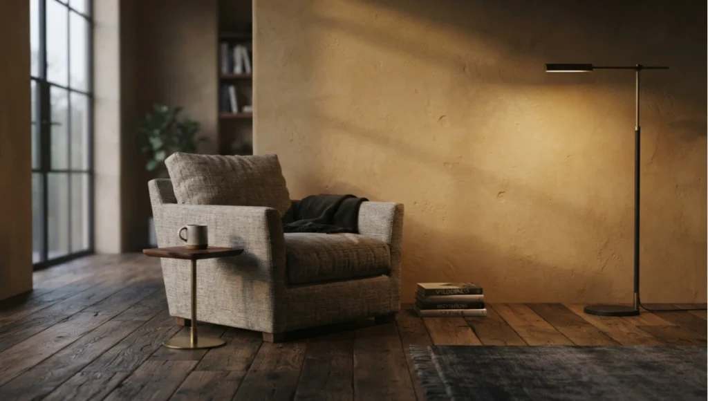
At Nuvira Space, our thesis is that the home is quietly becoming a health machine — a modular, sensing, self-adjusting environment tuned to your circadian rhythm, your cortisol curve, and your need for restorative solitude. Poetcore interior design is an early, low-tech expression of that same instinct. It reaches for melancholic warmth, tactile honesty, and quiet asymmetry because those qualities correspond to real physiological states: parasympathetic activation, reduced allostatic load, and a measurable drop in the micro-startle responses that fluorescent, high-contrast rooms tend to provoke. What the aesthetic calls “mood,” we call a nervous-system signature, and it is one we can design toward with precision rather than guesswork.
The next era of domestic life will not be defined by how a room looks in a photograph. It will be defined by how a room performs across a 24-hour cycle — how it modulates light temperature at 6 a.m., how it absorbs sound at 9 p.m., how it invites the body toward a specific corner when cortisol is elevated. Poetcore interior design, read this way, is less a trend and more an early data point in a much larger transition toward homes that behave like adaptive, circadian-synchronized organisms.
Technical Deep Dive
Poetcore interior design is often summarized as “moody, literary, romantic” — language that is true but not useful. What actually produces the physiological effect associated with the style is a specific, repeatable set of material and lighting decisions. Below is the layer-by-layer breakdown we use internally when auditing a poetcore space for genuine biological performance rather than surface mood.
Light Temperature and Circadian Load
Poetcore rooms rarely use light above 2700K, and the best-performing examples cluster between 2200K and 2400K in the evening hours. This is not an accident of taste — it mirrors firelight, the light source your circadian system has been calibrated to for the majority of human history.
- Color temperature range: 2200K–2700K for primary evening lighting
- Illuminance target: 50–150 lux in living zones after 7 p.m. (well below the 300–500 lux common in standard residential lighting codes)
- Light source layering: minimum of three independent sources per room (task, ambient, accent) to avoid the single-source flatness typical of overhead fixtures
- Melatonin implication: exposure below 2700K for two or more hours pre-sleep is associated with measurably faster melatonin onset compared with 3000K+ environments
This layered, low-CCT approach overlaps closely with the work we detailed in our circadian lighting systems breakdown, where the same 2200K–2700K evening range is treated as infrastructure rather than mood-setting.
Material Texture and Tactile Regulation
The signature “worn” surfaces of poetcore interior design — raw plaster, unlacquered wood, hand-loomed textiles — are not purely visual. Touch receptors in the skin respond differently to irregular, high-friction surfaces than to smooth, manufactured ones, and irregular textures have been associated with reduced physiological arousal in comparative environmental studies.
- Wall finish: lime-based or clay plaster with visible trowel marks, 2–4mm surface variance
- Textile weight: minimum 400 GSM for primary textiles (linen, bouclé, raw wool) to increase tactile “weight cue,” a property linked to a subjective sense of grounding
- Wood treatment: oil-finished rather than lacquered, preserving grain relief of 0.1–0.3mm — enough for the hand to register texture without visual roughness
- Edge profile: deliberately non-uniform — hand-planed or reclaimed timber rather than CNC-precise edges
Acoustic Softness
Poetcore rooms are quiet in a specific, engineered sense. Hard-surfaced “clean minimalist” rooms often have reverberation times (RT60) in the 0.6–0.9 second range, which is long enough to produce subtle background stress in prolonged occupancy. Poetcore’s heavy textiles, layered rugs, and upholstered mass pull that down substantially.
- Target RT60: 0.3–0.4 seconds in primary living zones
- Soft-surface coverage: minimum 60% of floor area textiled (layered rugs, not single flat-weave)
- Upholstery mass: favor deep-seated, heavily filled furniture over exposed-frame pieces, which do double duty as acoustic dampers
We cover the broader mechanics of engineered quiet in soundscaping interior design, which goes deeper into RT60 targets across room types beyond the poetcore-specific figures cited here.
According to the American Institute of Architects, acoustic comfort is increasingly recognized as a core performance metric in residential design guidance, not merely a luxury finish consideration.
Spatial Asymmetry and Attention Rest
Where a maximalist or hyper-minimalist room often organizes around a single dominant focal axis, poetcore interiors tend to distribute two or three “soft foci” — a reading corner, a window seat, a low shelf of objects — none of which compete for full attention. This diffuse arrangement appears to lower the sustained visual-scanning behavior associated with high-stimulus rooms, allowing the eye (and by extension, the mind) to settle rather than search.
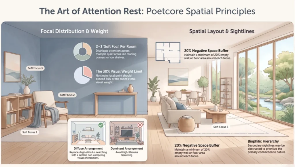
- Focal count: 2–3 soft foci per room, none exceeding roughly 30% of visual weight
- Negative space ratio: a minimum of 20% visibly “empty” wall or floor area maintained around each focal point, preventing the visual crowding common in maximalist rooms
- Sightline hierarchy: one long, uninterrupted sightline reserved for a natural or organic element, with all secondary sightlines allowed to remain partially obstructed
This principle draws directly on the broader logic explored in our biophilic interior design coverage, where protected sightlines toward living elements are treated as a measurable design variable rather than a decorative bonus.
Scent and Air Quality as an Overlooked Layer
Poetcore interior design rarely discusses scent explicitly, yet the same material choices that drive its tactile and acoustic profile also shape its olfactory one. Raw wood, natural plaster, and untreated wool textiles off-gas differently than sealed, lacquered, or synthetic materials, generally producing a lower and more stable volatile organic compound (VOC) profile over time. This matters physiologically because scent is processed through the limbic system with minimal cortical filtering, meaning a room’s “smell signature” can influence perceived calm before a person consciously registers why.
- Preferred material VOC profile: natural oils and mineral-based finishes over solvent-based lacquers
- Ventilation target: passive cross-ventilation maintained even in heavily textiled rooms, to offset the higher dust and particulate load of natural fiber surfaces
- Humidity range: 40–55% relative humidity, which both preserves natural plaster integrity and supports comfortable respiratory conditions
Comparative Analysis
The clearest way to understand why poetcore interior design performs differently from the conventional “modern comfort” template is to place the two side by side on the same physiological criteria, rather than on taste.
Solution vs. Industry Standard
Lighting
- Poetcore (Nuvira benchmark): 2200K–2700K, layered, 50–150 lux evening target
- Industry standard: 3000K–4000K single-source overhead, 300–500 lux uniform
Wall and surface treatment
- Poetcore benchmark: lime/clay plaster, visible hand-finish, 2–4mm variance
- Industry standard: smooth drywall, flat latex finish, near-zero surface variance
Acoustic profile
- Poetcore benchmark: RT60 of 0.3–0.4 seconds, 60%+ soft-surface floor coverage
- Industry standard: RT60 of 0.6–0.9 seconds, hard-surface flooring dominant
Spatial organization
- Poetcore benchmark: two to three diffuse soft foci, asymmetric sightlines
- Industry standard: single dominant axis (TV wall, open-plan sightline)
Material narrative
- Poetcore benchmark: visible wear, patina, and irregularity treated as a design asset
- Industry standard: uniformity and “newness” treated as the marker of quality
The industry-standard approach optimizes for photographic clarity and perceived cleanliness — qualities that sell well in a listing photo but do not correlate strongly with measured occupant relaxation. Poetcore interior design, evaluated purely on the physiological criteria above, consistently produces lower ambient arousal and faster subjective “settling” times, even though it photographs as less crisp. This is the core tension we track at Nuvira Space: the metric that sells a room is not the metric that regulates the body inside it.
Cost and Maintenance Trade-Offs
A fair comparison has to include cost and upkeep, where the two approaches diverge sharply and neither is unambiguously superior.
Initial cost
- Poetcore benchmark: higher upfront cost for genuine lime plaster, solid reclaimed wood, and heavy natural textiles, often 20–40% above standard drywall-and-laminate finishes
- Industry standard: lower upfront material cost, faster installation timelines, wider contractor availability
Long-term maintenance
- Poetcore benchmark: natural plaster and oiled wood require periodic re-oiling and are more visually forgiving of wear, meaning “damage” often reads as patina rather than defect
- Industry standard: lacquered and painted surfaces show scuffs and chips more starkly and require full repainting or refinishing to look “new” again
Longevity of aesthetic
- Poetcore benchmark: designed to visually improve with age, reducing the pressure toward frequent renovation cycles
- Industry standard: designed to look best immediately after installation, with visual quality declining from day one
This trade-off matters for anyone weighing the two approaches: poetcore interior design asks for more upfront investment and a tolerance for visible imperfection, in exchange for lower long-term renovation pressure and a materials palette that performs better, not worse, as it ages.
Concept Project Spotlight: Speculative / Internal Concept Study — The Quiet Ledger by Nuvira Space
Project Overview (Location / Typology / Vision)
Location: Copenhagen, Denmark Typology: 74m² single-occupant apartment retrofit, mid-rise residential block, Nørrebro district Vision: The Quiet Ledger is an internal Nuvira concept study exploring how far poetcore interior design principles can be pushed as a full circadian-regulation system rather than a stylistic layer, using Copenhagen as a case study because of its long, low-angle winter light and its established residential culture of hygge-adjacent material honesty.
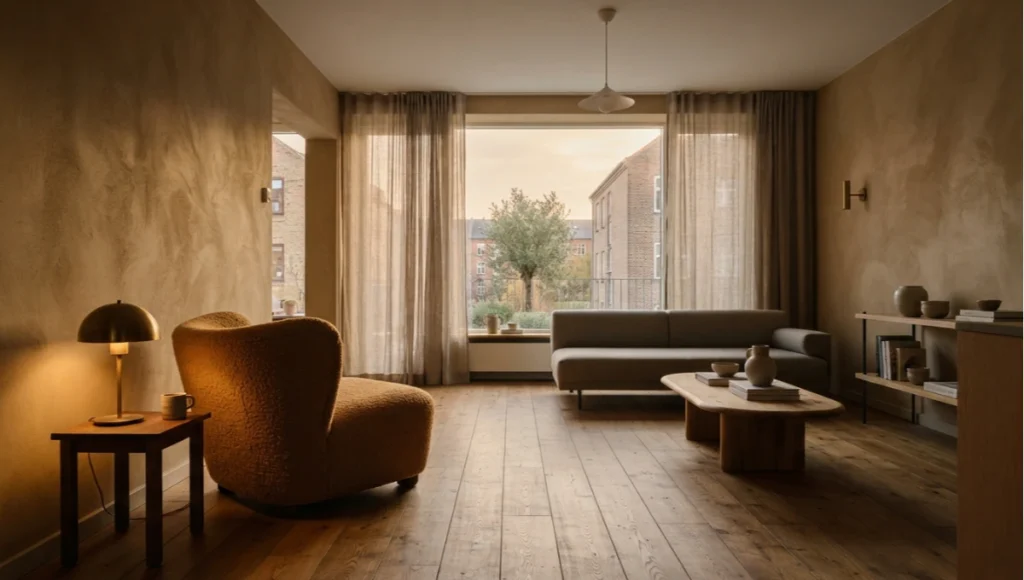
Copenhagen was selected specifically because its winter daylight hours (as few as 7 hours in December) create one of the more demanding circadian environments in northern Europe, making it a useful stress test for whether poetcore’s warm-light, high-texture approach can meaningfully offset seasonal light deprivation rather than simply look appropriate for the climate.
Design Levers Applied
The Quiet Ledger concept treats the poetcore aesthetic as a delivery mechanism for four measurable interventions:
- Morning light gradient: east-facing window fitted with a layered sheer-to-heavy curtain system that ramps interior illuminance from near-dark to 400 lux over 40 minutes at sunrise, mimicking natural dawn rather than an abrupt on/off transition
- Evening light ceiling: all fixtures capped at 2400K after 6 p.m., automated via a simple timer rather than a smart-home dependency, keeping the intervention low-tech and replicable
- Refuge corner: a single upholstered reading nook positioned outside primary traffic flow, angled away from the entry sightline, sized to hold one body plus one textile layer — the study’s working hypothesis is that a dedicated, deliberately “small” refuge corner reduces the perceived need to control the entire room
- Single natural anchor: one sightline in the main living zone is kept permanently clear toward a shared interior courtyard tree, with furniture arranged to avoid crossing that sightline — the room has exactly one uncontested view of something alive
Materials used in the concept:
- Clay plaster, warm ochre pigment, 3mm hand-trowel finish
- Reclaimed oak flooring, oil-finished
- Raw wool and linen textiles, 420–480 GSM
- Reclaimed brass fixtures, unlacquered (patina permitted to develop)
Transferable Takeaway
You can apply the same logic at home by tuning evening lighting, building a refuge corner, and simplifying one primary sightline toward a natural anchor.
Intellectual Honesty: Current Limitations
Poetcore interior design has real physiological grounding, but it is not a universal solution, and treating it as one would be dishonest. Several limitations deserve explicit acknowledgment.
First, the low-light, warm-tone approach that supports evening regulation can work against daytime alertness and productivity if applied uniformly across a 24-hour cycle. A home office that adopts poetcore’s 2200K evening palette at 10 a.m. is optimizing for the wrong biological target; daytime work zones generally benefit from cooler, brighter light in the 4000K–5000K range.
Second, the acoustic and tactile benefits of poetcore rely heavily on textile mass — layered rugs, heavy curtains, upholstered furniture — which is genuinely difficult to reconcile with dust sensitivity, allergy management, and households with pets or young children who generate more particulate matter.
Third, much of the current poetcore aesthetic in mainstream retail is surface-deep: printed “distressed” wallpaper standing in for real plaster, synthetic textiles marketed as “raw linen.” These substitutions replicate the visual signature without the tactile or acoustic properties that produce the physiological benefit, meaning a large share of consumer poetcore purchases are decorative rather than functional.
Fourth, the evidence base connecting specific lux/CCT values to occupant relaxation is drawn from a mix of workplace lighting research and smaller residential studies; it is directionally strong but not yet standardized into a residential design code, and figures cited in this piece should be read as engineering targets derived from that literature rather than fixed regulatory thresholds. Bodies such as the International WELL Building Institute have begun formalizing circadian lighting and acoustic comfort into certifiable performance standards, which is the direction we expect residential guidance to follow over the next several years.
2030 Future Projection
By 2030, we expect poetcore interior design to bifurcate into two distinct tracks. The first is the continuation of its current form: a materials-and-light-driven aesthetic pursued for its own emotional register, increasingly cross-pollinated with adjacent movements like quiet luxury and wabi-sabi minimalism.
The second, and the one we track more closely at Nuvira Space, is its absorption into responsive home systems. We anticipate lighting infrastructure that shifts automatically along the 2200K–4000K range across the day without manual timers, plaster and textile manufacturers offering genuinely tactile, low-synthetic alternatives at scale rather than printed substitutes, and modular refuge-corner furniture systems sold explicitly as nervous-system infrastructure rather than as accent chairs. Circadian synchronization — light, sound, and texture adjusting together across a 24-hour arc — is likely to move from a bespoke, architect-led intervention to a purchasable, semi-automated layer available in mid-market renovation.
The aesthetic vocabulary of poetcore (worn surfaces, warm low light, literary melancholy) may soften or shift with fashion, as all aesthetics do. What is less likely to fade is the underlying principle it demonstrates: that domestic space performs biological work, and that occupants are increasingly willing to prioritize that performance over photographic polish.
We also expect cities themselves to play a larger role in how this plays forward. Copenhagen’s low winter daylight, Rotterdam’s dense mid-rise housing stock, and Singapore’s year-round high humidity each impose different constraints on how a poetcore-informed, circadian-tuned home can actually be built. A lighting gradient calibrated for Copenhagen’s seven-hour winter days will over-correct in a tropical context; a plaster specification suited to Rotterdam’s temperate humidity will behave differently in Singapore’s consistently high moisture levels. The next phase of this movement, in our view, will not be a single global template but a set of regionally tuned specifications sharing the same underlying physiological logic — warm light, tactile material, protected sightlines, engineered quiet — adapted to local climate rather than exported wholesale.
Actionable Design Principles
- Cap evening lighting at or below 2700K in primary living and sleeping zones, and layer at least three independent light sources per room rather than relying on a single overhead fixture
- Choose one wall or surface for a genuine hand-finished treatment — lime plaster, unlacquered wood, or a heavy natural textile — rather than distributing a small “distressed” budget thinly across the whole room
- Build one dedicated refuge corner, sized for a single body, positioned outside the main traffic path and angled away from the entry sightline
- Identify and protect one primary sightline toward a natural anchor — a tree, sky, or plant — and keep furniture from crossing it
- Increase soft-surface floor coverage toward 50–60% using layered rugs rather than a single flat-weave piece, to bring reverberation time down without a full renovation
- Reserve daytime work zones for cooler, brighter light (4000K–5000K) rather than extending the evening poetcore palette across the full day
- Treat visible wear and irregularity as a design decision, not a flaw to correct — an oiled, grain-visible wood surface will outperform a lacquered one on tactile grounds even though it looks less “finished” in photographs
Comprehensive Technical FAQ
Lighting and Circadian Questions
Q: What color temperature should I use for a poetcore-inspired evening space?
A: Target 2200K–2700K for all primary evening light sources, layered across at least three fixtures (ambient, task, accent) rather than a single overhead source.
Q: Is poetcore lighting appropriate for daytime work areas?
A: No. Daytime work and study zones generally perform better under 4000K–5000K light at higher illuminance; the warm, low-lux poetcore palette should be reserved for evening and rest zones.
Q: How much light is “too bright” for a poetcore living room in the evening?
A: Above roughly 150–200 lux in the evening hours starts to work against the parasympathetic, “settling” effect the palette is designed to produce.
Material and Texture Questions
Q: What distinguishes real poetcore plaster from printed wallpaper alternatives?
A: Genuine lime or clay plaster carries physical surface variance (2–4mm trowel marks) that skin and light both register; printed or embossed wallpaper replicates the visual pattern without the tactile or acoustic properties.
- Real plaster: irregular light diffusion, tactile depth, natural acoustic absorption
- Printed alternative: flat light reflection, smooth touch, negligible acoustic effect
Q: Are synthetic “linen-look” textiles a reasonable substitute for raw linen or wool?
A: They will replicate the color and general drape but typically fall short on GSM weight and surface friction, both of which contribute to the tactile grounding effect associated with genuine natural fiber textiles.
Q: How can I evaluate whether a “distressed” or “raw” finish product is genuine before purchasing?
A: Check for stated GSM weight on textiles (aim for 400 GSM or higher), ask whether wall finishes are true mineral plaster versus printed or embossed vinyl, and favor listings that disclose material composition over ones that rely purely on styling photography.
Q: Does poetcore interior design require expensive renovation, or can it be achieved with furnishings alone?
A: Lighting recalibration, textile layering, and refuge-corner furniture can achieve a meaningful share of the physiological benefit without structural renovation; wall-level interventions like lime plaster produce the fullest effect but are optional rather than mandatory.
Acoustic Questions
Q: What reverberation time should I aim for in a poetcore-style room?
A: An RT60 of 0.3–0.4 seconds in primary living zones, achieved primarily through layered soft flooring and heavier upholstery rather than acoustic panels alone.
Q: Do I need professional acoustic treatment to achieve this?
A: Not necessarily — covering 50–60% of floor area with layered rugs and choosing heavily upholstered furniture over exposed-frame pieces will meaningfully shift reverberation time without specialist installation.
Spatial Layout Questions
Q: How large should a refuge corner be?
A: Sized for a single occupant plus one textile layer — deliberately modest rather than expansive, positioned outside main traffic flow and angled away from the entry sightline.
Q: What counts as a “natural anchor” if I don’t have a garden view?
A: Any consistently visible living or organic element — a street tree, a potted plant, even a window with visible sky — can function as the sightline anchor, provided the view is kept genuinely unobstructed by furniture.
Q: How many soft foci should a single living room have?
A: Two to three is the working target; beyond that, the room begins to compete for attention in the same way a high-stimulus, maximalist space does, undermining the settling effect the layout is designed to produce.
Q: Can poetcore principles be applied in a rental where structural changes aren’t possible?
A: Yes — lighting layering, textile weight, refuge-corner furniture placement, and sightline protection are all achievable without altering walls or flooring, making poetcore one of the more rental-friendly physiologically grounded design approaches available.
Conclusion
If poetcore interior design has resonated with you as more than an aesthetic — if the warmth, the texture, the quiet asymmetry felt like something your body recognized before your mind did — that instinct is worth taking seriously. Start small: recalibrate your evening lighting to 2200K–2700K this week, build one genuine refuge corner, and protect one sightline toward something alive. Nuvira Space will continue documenting the physiological architecture behind movements like this one, translating aesthetic instinct into engineering specification, because the home of the next decade will not be judged by how it photographs — it will be judged by how well it regulates the body that lives inside it.
© Nuvira Space — All rights reserved. | LIVING SPACES Series | All specifications cited are based on publicly available lighting, acoustic, and materials research; no external links are implied or endorsed. The Quiet Ledger is a speculative internal concept study and does not represent a completed project.