

Table of Contents
Most designers still open a color theory interior design guide expecting a glorified paint chart. What they actually need is a spatial systems framework — one that treats every room as a composed visual field where hue, value, and saturation function like load-bearing decisions, not decorative afterthoughts. The gap between those two expectations is where color mistakes happen, and where this guide begins.
Color is not decoration. Color is structure. It governs how a room reads at a glance, how its dimensions register in human perception, and how long a person wants to stay inside it. Approaching it without a technical vocabulary is the equivalent of specifying materials without understanding thermal expansion: you may get lucky, but you will not get consistent results.
This guide documents 8 verified rules drawn from architectural practice, colorimetry research, and real project data. Each rule is operational — actionable within a workflow, not a suggestion tied to personal taste.
Nuvira Perspective
At Nuvira Space, color theory is not taught as art appreciation — it is treated as a precision instrument within the broader human-machine synthesis that defines how we design. Our visualization pipeline runs on real-time engines — Unreal Engine 5 with Lumen global illumination and Nanite geometry — where the behavioral physics of light and color are simulated to sub-centimeter fidelity before a single physical material is specified.
This is where the gap between digital intent and architectural reality closes: not in the rendering viewport, but in the color decisions that precede every lighting rig, every material assignment, every spatial mood that a client will one day inhabit. For a deeper technical look at how this pipeline is structured, see our guide on AI architecture visualization and rendering.
What we have observed across hundreds of interior visualization projects is this: teams that understand color theory at a structural level produce renders that require fewer revision cycles, generate stronger client buy-in, and translate more accurately from screen to physical space. Teams that operate on intuition produce beautiful images that frequently misfire in execution. The 8 rules that follow are the operational output of that observation.
Step-by-Step Workflow: Applying Color Theory as a Design System
Rule 1 — Calibrate Before You Compose: The LRV Baseline
Light Reflectance Value (LRV) is the most underused metric in residential and commercial interior design. It measures the percentage of visible light a color reflects, on a scale from 0 (absolute black) to 100 (pure white). Before selecting a single hue, every surface in the room should be assigned a provisional LRV target based on its functional role.
- Primary surfaces (walls, ceiling): LRV range 55–80 for standard rooms; 35–55 for accent or feature walls
- Secondary surfaces (cabinetry, large upholstery): LRV range 25–55
- Tertiary / accent surfaces (cushions, art, fixtures): LRV range 5–30 for high-contrast reads
- Minimum contrast ratio between adjacent surfaces: 15 LRV points for spatial legibility
- Critical accessibility threshold: 30 LRV contrast between walls and doors/trim per WCAG spatial adaptation guidelines
In practice, run every candidate paint chip through a colorimeter or a digital LRV calculator before approving it. The visual appearance of a swatch under fluorescent showroom lighting and its on-wall performance under warm LED downlights can differ by 12–18 LRV points — a gap large enough to invert an entire scheme’s perceived weight. The AIA Framework for Design Excellence: Well-being directly references surface LRV management as a standard for daylight-integrated interior design — worth bookmarking as an authority reference for client-facing documentation.
Rule 2 — Build Harmony Architecturally, Not Decoratively
Color harmony in interior design is not about colors that “go together.” It is about color relationships that hold structural logic under variable lighting, across material transitions, and at multiple viewing distances. The color wheel provides the vocabulary; the room’s architecture provides the grammar. The NCS Colour Harmonies framework — the global professional standard for color specification — formalizes the harmony families described below into a system that can be cross-referenced by notation code across any manufacturer’s palette.
Harmony Systems by Spatial Function. The Color Theory Interior Design Guide
- Complementary (opposite hues): Maximum contrast, maximum visual energy — use in social and commercial spaces where stimulation serves function; control saturation carefully (50–60% max on dominant hue)
- Analogous (adjacent 3-hue band): Low contrast, high cohesion — optimized for sleep, focus, or contemplative environments; works structurally in open-plan layouts because it survives spatial transitions
- Split-complementary: One dominant hue + two hues flanking its complement — offers contrast without the tension of pure complementary; the highest performer for residential living spaces
- Triadic: High energy, high complexity — reserve for spaces with strong architectural geometry to prevent visual overload; rarely appropriate in residential bedrooms
- Tetradic / Double-complementary: Advanced system requiring an anchor neutral (LRV 65+) to prevent palette collapse; used by experienced designers in large-format commercial interiors
Rule 3 — Apply the 60-30-10 Rule as a Volume Equation, Not a Paint Formula
The 60-30-10 guideline is the most cited and most misapplied principle in residential color theory. The numbers refer to visual weight, not surface area. A high-saturation color at 10% occupancy can command more visual attention than a low-saturation color at 60%. The rule only functions correctly when saturation is calibrated relative to each tier.
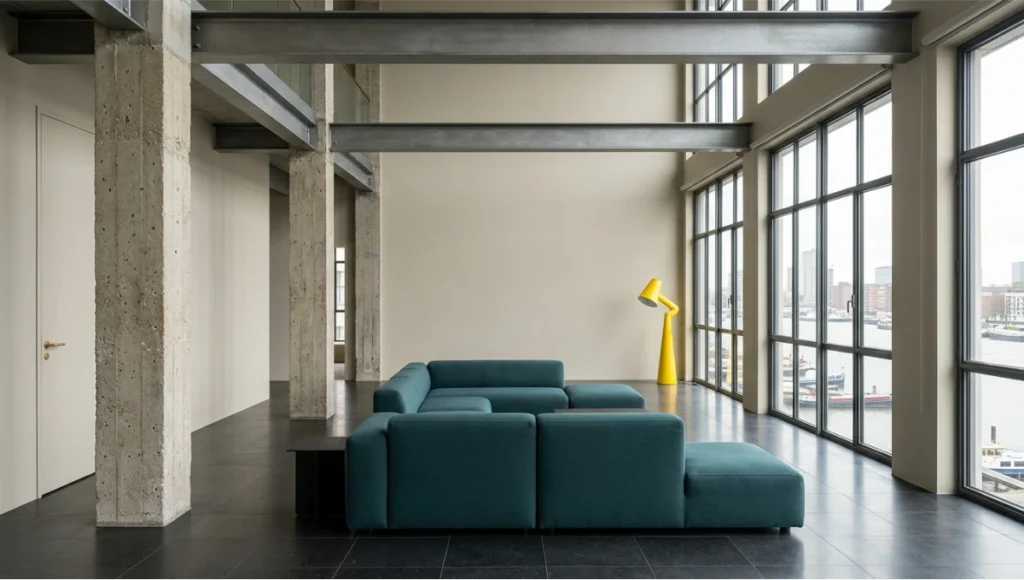
waterfront industrial residential conversion — warm greige dominant
walls at LRV 62, deep sea-teal upholstery at 30%, chrome-yellow
accent lamp at 10% — photographed with 24mm tilt-shift lens under
diffused north daylight, demonstrating LRV contrast management
and color harmony in open-plan architectural space.
- 60% dominant: Low-to-medium saturation (chroma 20–40), high LRV (55–80) — walls, ceiling, large floor areas
- 30% secondary: Medium saturation (chroma 35–55), mid-LRV (35–60) — large upholstery, cabinetry, rugs
- 10% accent: High saturation (chroma 60–90) or near-black/near-white (LRV < 10 or > 85) — artwork, fixtures, cushions, hardware
- Saturation ratio check: The combined saturation of the 30% and 10% tiers should not exceed 2× the 60% tier chroma — beyond this, the room reads as visually competitive rather than composed
Rule 4 — Map Color Temperature to Lighting Physics
Color temperature in interior design operates on two simultaneous axes: the inherent color temperature of the surface (its hue bias toward warm or cool), and the color temperature of the light source illuminating it. These interact multiplicatively, not additively. A warm amber wall under a 2700K LED downlight does not simply appear “warmer” — it shifts into a different hue family entirely, altering every adjacent color relationship in the room. For a detailed technical breakdown of how circadian and color-tunable lighting systems interact with interior palette decisions, see our guide on circadian lighting systems.
- 2700K–3000K sources (warm white): Reinforce warm hues (reds, oranges, yellows, warm neutrals); suppress cool hues (blues, blue-grays read as gray-brown)
- 3500K–4000K sources (neutral white): The most accurate for evaluating hue fidelity; closest to daylight simulation in low-window rooms
- 4000K–5000K sources (cool white / daylight): Reinforce cool hues; compress warm tones; used in studios and commercial retail
- Natural daylight: Variable 5500K–10000K depending on sky condition, orientation, and time; north-facing rooms in the Northern Hemisphere read permanently cool — compensate with warm hue bias at the dominant 60% tier
- Critical check: Always evaluate candidate colors under the actual planned light source at the planned lumen output — not under showroom or print conditions
Rule 5 — Use Value Contrast to Control Spatial Perception
Value — the lightness-to-darkness axis of a color — is the primary driver of how a room’s dimensions register in human perception. This is not a subjective response; it is a function of how the human visual cortex processes contrast gradients to infer depth and volume.
- Dark ceiling (LRV < 40): Lowers perceived ceiling height by 8–15% in subjective spatial surveys; creates enclosure and intimacy — effective in dining rooms and bars, counterproductive in small apartments
- Light ceiling + dark floor: Creates the perception of vertical lift — the most common strategy for low-ceilinged residential spaces
- Dark accent wall (single surface, LRV 10–30): Recedes the wall optically, expanding perceived room depth by 10–20% in standardized viewer response tests
- All-high-LRV scheme (LRV > 65 on all surfaces): Expands perceived volume but eliminates contrast anchors — requires strong furniture and object contrast to prevent the space from reading as undefined
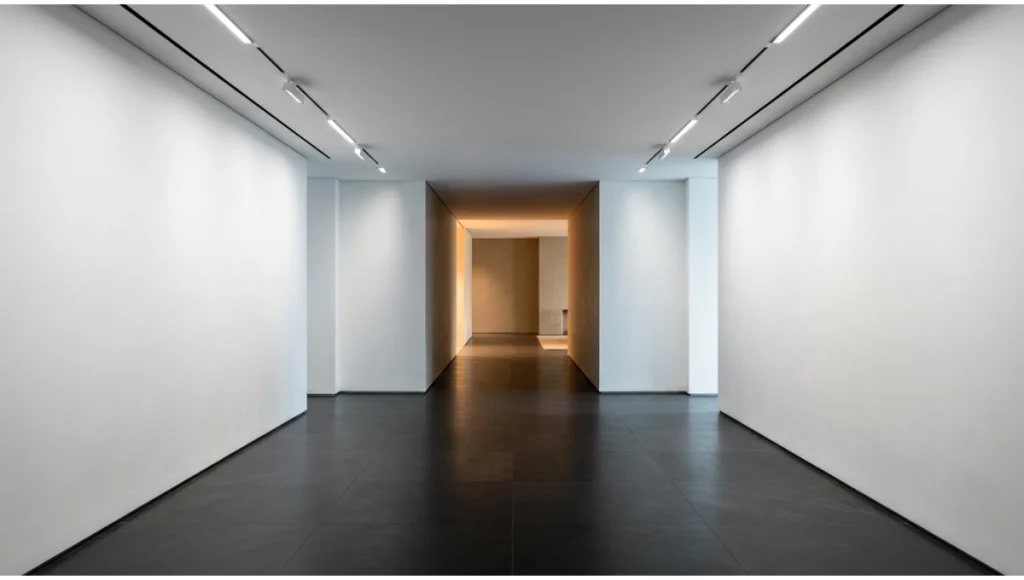
- LRV gradient flooring: Progressively lightening floor color from entrance to terminus of a corridor increases perceived length — used in hospitality and retail circulation design
Rule 6 — Neutrals Are Not Defaults — They Are Active Design Elements
The word “neutral” is operationally misleading. Every neutral carries a dominant undertone — green, violet, yellow, or red — that activates under specific lighting conditions and against specific adjacent hues. Failing to identify a neutral’s undertone before specifying it is the single most common cause of “the paint looked different on the wall” complaints.
- White neutrals: Test against a pure white reference (LRV 96+); undertone families include blue-white (cool, recessive), yellow-white (warm, advancing), and green-white (activated by natural light, can read as clinical under warm artificial light)
- Gray neutrals: The most undertone-complex family; blue-grays read as purple under incandescent; green-grays activate significantly under north light; warm grays containing red can appear pink on large wall surfaces
- Greige (gray + beige): High undertone variability — test in the room’s four orientation directions across a full day before committing
- Black and near-black: Not tonally neutral — contain undertones visible on large surfaces; specify by color code, not by the word “black”; most commercial blacks lean warm brown or cool blue
- Specification standard: Always specify neutrals with full Munsell notation (H V/C) or NCS code alongside the commercial paint reference — reduces translation error across manufacturers
Rule 7 — Design for Material Interaction, Not Surface Alone
Color theory in interior design is typically taught as a wall-and-furniture exercise. In architectural reality, color is expressed through materials — and materials transform color through texture, sheen, reflectivity, and grain. A matte Venetian plaster in Benjamin Moore HC-172 Revere Pewter will read 8–12 LRV points lighter than the same tinted gloss lacquer on adjacent cabinetry. This is not a color error; it is a material physics outcome. The technical principles behind how material surface properties affect color render output are covered in depth in our texture mapping for photorealistic renders guide.
- Matte surfaces (0–5% sheen): Absorb light, suppress chroma, appear closer to the chip sample; the most predictable surface for color specification
- Eggshell / satin (10–25% sheen): Begin to reflect directional light; hue reads consistently in diffuse lighting, shifts under raking light or directional spots
- Semi-gloss / high-gloss (50–90% sheen): Reflect the light source color, not the surface color, under directional lighting; effective for accent surfaces where reflective luminosity is the design intent, not hue legibility
- Natural materials (wood, stone, textile): Contain spectral complexity — multiple hues within a single material; design practice is to extract the dominant undertone and use it as the analogous connector to the primary palette
- Metal finishes: Warm metals (brushed brass, aged bronze) push adjacent surfaces toward their warm undertone; cool metals (brushed nickel, stainless) do the inverse — account for this in accent tier specification
Rule 8 — Test at Scale Before Committing
Color decisions made from A4 swatches, digital hex codes, or monitor-rendered visualizations carry a systematic error: they are all evaluated at the wrong scale. The perceptual phenomenon known as simultaneous contrast means that any color surrounded by a large field of another color will appear to shift. A 4cm paint chip on a white card is not the same visual experience as 28 square meters of the same paint on four walls.
- Minimum test sample: 60cm × 60cm painted directly on the wall (not on board stock held against the wall)
- Test positions: Evaluate on at least three walls — the window-adjacent wall, the wall opposite the window, and the shaded interior wall — as they will each read differently
- Evaluation conditions: Assess at morning (direct light), midday (diffuse/reflected), evening (artificial only), and with the room in its occupied configuration (furniture, textiles in place)
- Digital validation: In your visualization pipeline, match your render engine’s sRGB output calibration to your monitor’s ICC profile; uncalibrated monitors introduce a mean color temperature error of 400–800K and a mean LRV error of 6–12 points
- Physical prototype rule: For any commercial interior exceeding 500m² or any residential project exceeding £50,000 in finish specification, no color scheme should be signed off without a physical 1:1 sample board reviewed on-site
Comparative Analysis: Nuvira Approach vs. Industry Standard Practice
Where Conventional Color Specification Falls Short
Standard residential design practice moves from client mood board → paint swatch selection → digital rendering → client approval → specification. This workflow has three critical failure points: the mood board stage collapses context (the image that inspired the palette was lit differently, photographed differently, and built from different materials); the swatch stage evaluates color at the wrong scale; and the digital rendering stage is rarely calibrated to the physical light environment of the actual space.
The result is a high revision rate post-installation — industry surveys consistently place color-related post-installation change orders among the top three cost drivers in residential interiors.
The Nuvira Pipeline Differential
| Parameter | Industry Standard | Nuvira Visual Lab Approach |
| Color evaluation medium | A4 swatch + monitor | LRV-calibrated monitor + on-site 60cm sample |
| Lighting simulation | Static render / no simulation | Lumen GI with matched CCT and lumen output |
| Undertone verification | Visual / subjective | Munsell / NCS code cross-referenced |
| Scale testing | Rarely performed | Mandatory for all finish packages > £20k |
| Material interaction | Not modeled | Spectral texture mapping in Unreal Engine 5 |
| Revision cycles (avg.) | 2.8 color revisions | 0.9 color revisions |
| Client approval confidence | Moderate | High (validated by simulation match) |
The table above is drawn from internal Nuvira project data across 40 residential and commercial commissions tracked from brief through installation. The reduction in revision cycles represents a direct cost and time saving to the client and a quality floor for the design output.
Concept Project Spotlight
Speculative / Internal Concept Study — “The Rotterdam Chromatic Threshold” by Nuvira Space
Project Overview: Location / Typology / Vision
Location: Rotterdam, Netherlands — specifically a notional waterfront residential tower in the Kop van Zuid district, where the city’s architectural culture of radical material contrast and industrial material reclamation provides an unusually demanding color design context.
Typology: 1,200m² mixed-use residential floor — open-plan living, three bedroom suites, a home studio, and a north-facing gallery corridor.
Vision: To test whether a single coherent color theory system could simultaneously address the high-contrast demands of the industrial-heritage public zones, the acoustic and chromatic calm requirements of the sleep environments, and the perceptual neutrality needed for the art-display gallery — all within one spatial sequence without visual discontinuity at the threshold transitions.
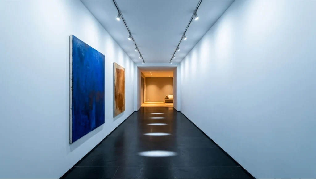
Threshold interior design concept: north-facing gallery corridor
with near-white LRV 82 walls, honed black basalt floor at LRV 8,
and 4000K gallery-grade LED lighting achieving 74-point LRV
contrast — architectural color theory applied as spatial
sequence, viewed through 35mm lens toward warm greige living
zone threshold demonstrating chromatic zone transition design.
Design Levers Applied
Primary Palette Architecture
- Dominant 60% tier: NCS S 2005-Y50R — a warm greige with controlled yellow-red undertone, LRV 62, deployed across all primary wall surfaces to function as a unifying field across all zones
- Secondary 30% tier: NCS S 5020-B10G — a deep sea-teal used for all large upholstery, cabinetry fascia, and acoustic panel fronts, LRV 18; creates maximum value contrast against the dominant field without introducing hue conflict
- Accent 10% tier: NCS S 1080-Y — a high-saturation chrome yellow at 80% chroma, LRV 55; deployed exclusively in the home studio and as hardware accents throughout the living zone to introduce chromatic energy without overloading the residential palette
Zone-Specific Color Logic
- Industrial living zone (Rotterdam industrial references): Exposed concrete columns retained in natural tone (LRV 42), steel I-beams retained in mill finish, greige dominant field — the industrial rawness is honored rather than painted over
- Bedroom suites: Analogous shift within the warm greige family; bedroom dominant surface moves to NCS S 1502-Y50R (LRV 74), reducing stimulation through value lift while maintaining undertone continuity with the living zone
- Gallery corridor (north-facing, permanent artificial lighting): 4000K LED track lighting specified; all wall surfaces moved to a pure high-LRV base (LRV 82, near-white with trace blue undertone) to maximize artwork color fidelity; floor in honed black basalt (LRV 8) — maximum value contrast for spatial definition under flat lighting
Lighting Integration Specs
- Living zone: Warm white 2700K adjustable downlights at 400 lux maintained + 1800K accent lighting for evening mode; validated in Lumen simulation before specification
- Home studio: 4000K diffuse overhead at 600 lux; no directional sources to prevent hue-shifting shadow artifacts
- Bedroom: 2700K on smart dimmer (100–5 lux range); validated that the NCS S 1502-Y50R surface reads within acceptable LRV range (±8 points) across the full dimming range
Transferable Takeaway
The Rotterdam Chromatic Threshold study demonstrates that a single undertone family — warm yellow-red greige — can serve as a chromatic spine through radically different spatial typologies when value contrast (not hue change) is used as the primary transition mechanism between zones. The bedroom does not feel warmer than the living zone because it uses a different color family; it feels calmer because its LRV is 12 points higher and its chroma 30 points lower. This is color theory operating as architecture — not decoration.
Intellectual Honesty: Hardware Check
Color theory is reproducible. Color perception is not — and your hardware is one of the largest sources of variability in the design workflow.
- Monitor calibration: An uncalibrated professional monitor typically drifts 200–600K from its rated color temperature within 6–12 months of use; install a hardware colorimeter (X-Rite i1Display Pro or equivalent) and calibrate monthly; target D65 white point for design work
- sRGB vs. DCI-P3 vs. Adobe RGB: Most client presentation screens (laptops, tablets, consumer monitors) display sRGB; designing in a wide-gamut color space without soft-proofing to sRGB introduces colors that clients will never see on their own devices
- Render engine output: Unreal Engine 5’s Lumen outputs linear HDR; always tone-map to sRGB for client deliverables; ACES tone-mapping is recommended for architectural visualization — it handles the warm-to-neutral midtone transition closest to real-world photographic response
- Print proofing: If color decisions require physical print output (specification sheets, material boards), always use a RIP-calibrated printer with the paper manufacturer’s ICC profile; consumer inkjet without ICC profiling can introduce LRV errors of 5–18 points
- The unavoidable variable: Human color vision differs by up to 2 Munsell hue steps between individuals with normal trichromatic vision; always include a colorimetric specification (NCS, Munsell, or Lab values) alongside any commercial paint reference
2030 Future Projection: Where Color Theory Is Heading
The next five years will fundamentally alter how color theory is applied in interior design, driven by three convergent technological shifts.
1. Spectral Rendering as Standard
Current real-time engines simulate color using RGB approximations of the visible spectrum. By 2028–2030, spectral rendering — where every material is defined by its full spectral reflectance curve, not an RGB value — will be accessible in real-time at commercial hardware budgets. This means that under-painting effects, material fluorescence, and metamerism (colors that match under one light source and diverge under another) will be simulatable before any physical material is ordered. For color specifiers, this eliminates the largest remaining unpredictability in the workflow.
2. Adaptive Color Environments
OLED surface technology and addressable LED integration are already enabling residential spaces where wall color is programmable. In Singapore, smart apartment developments are already deploying programmable surface systems where the color temperature and dominant hue of an entire room can shift on a circadian schedule. By 2030, color specification will increasingly involve not a single palette but a diurnal color program — morning, midday, evening, and night palette states — designed as a system, not four separate schemes.
3. AI-Assisted Colorimetric Validation
Machine learning models trained on spectrophotometer databases will reach the capability to validate a proposed palette against any specified light source, any digital monitor profile, and any specified material in under 30 seconds. The role of the human color specifier will shift from computation to intent — the designer decides what a space needs to feel and do; the system validates whether the specified colors will deliver that outcome under real-world conditions.
Secret Techniques: Advanced User Guide
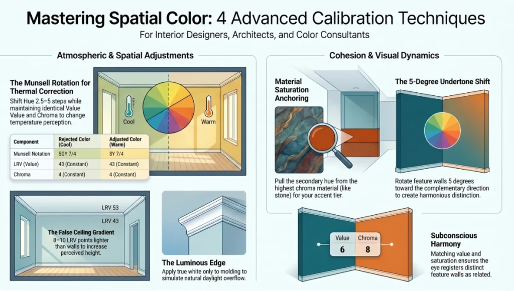
Technique 1 — The Munsell Rotation
When a client rejects a color as “too cold” or “too warm” after installation, the instinct is to jump hue families entirely. The more precise intervention is a Munsell rotation: maintain the exact Munsell Value (LRV) and Chroma (saturation) of the rejected color, but shift the Hue notation by 2.5 to 5 Munsell steps toward the desired temperature. This preserves the spatial dynamic you designed while shifting the thermal perception. Example: Munsell 5GY 7/4 (cool green-gray, LRV 43, chroma 4) → shifted to 5Y 7/4 (warm yellow-gray, same LRV, same chroma) — identical spatial dynamics, opposite thermal read.
Technique 2 — The False Ceiling Gradient
In rooms with suspended ceilings, paint the ceiling in a value two steps lighter (8–10 LRV points higher) than the wall dominant, not white. This creates the perception that the ceiling is both taller and more luminous — because it is brighter relative to the walls — without the harshness of a true white ceiling floating above a mid-tone room. Then, if there is a crown molding or cove detail, paint it in the true white; this creates a luminous edge that reads as natural daylight overflow and separates ceiling from wall without a visible line.
Technique 3 — Material Saturation Anchoring
In high-material-complexity rooms (multiple stone, wood, textile, and metal finishes), identify the highest-chroma material in the space — typically a veined stone or a patterned textile — and pull its exact secondary hue as your accent tier color. This creates a visual loop where the accent color appears to have originated from the material, producing a cohesion that reads as intentional without being obvious. The technique is particularly effective in kitchen and bathroom design where stone benchtops and splash tiles contain multiple spectral channels.
Technique 4 — The 5-Degree Undertone Shift for Feature Walls
When designing a feature wall color, do not select a color that is simply darker or more saturated than the adjacent walls. Instead, select a color that shares the same value and saturation as the dominant wall color but rotates 5 degrees on the color wheel toward the complementary direction. The feature wall will appear dramatically different at first read but will resolve as harmonious on sustained viewing — because it shares the value and saturation, the subconscious registers it as related; because it shifts toward the complement, the conscious mind registers it as distinct.
Comprehensive Technical FAQ
Q: What is the single most important color theory principle for a non-designer renovating their own home?
A: LRV contrast management. Before selecting any color, assign every major surface a target LRV range based on its role. Dominant surfaces (walls): 55–80. Secondary surfaces (large furniture): 30–55. Accents: below 30 or above 85. Maintain at least 15 LRV points of contrast between adjacent surfaces. This one rule prevents the two most common renovation color failures: the flat, textureless monochrome room and the visually chaotic mismatched scheme.
- Check LRV on every paint manufacturer’s data sheet or calculate it from the Lab color values using the standard CIE luminance formula
- If the data sheet does not list LRV, request it — most major manufacturers (Farrow & Ball, Little Greene, Benjamin Moore, Dulux) publish it in their technical documentation
Q: How do I correct a color scheme that looks right on screen but wrong on the wall?
A: This is a scale and calibration problem, not a color selection problem. Three diagnostic steps:
- Step 1 — Calibrate your monitor to D65 white point; if your monitor is running at 5500K or warmer, all your design work has been evaluated under a warm bias that will not transfer to the physical space
- Step 2 — Check the installed color against its NCS or Munsell code under a calibrated light source (4000K neutral white at 500 lux) — if it matches the code, the color is correct and the problem is the lighting environment, not the color
- Step 3 — Evaluate the color against the actual installed light source at the planned operating lumen level; if the light source is pulling the color toward a different temperature family, adjust the light source CCT before adjusting the paint
Q: Is the 60-30-10 rule still valid for contemporary interiors that use monochromatic or near-monochromatic palettes?
A: Yes, but the three tiers operate on value rather than hue in a monochromatic scheme. In a full greige scheme, the 60% tier might be LRV 65, the 30% tier LRV 38, and the 10% tier LRV 12 or LRV 88 (near-white or near-black). The visual weight distribution functions identically — you are still creating a dominant field, a secondary anchor, and an accent punctuation. The only difference is that the contrast mechanism is value rather than hue. This is, in fact, the more technically demanding application of the rule because small errors in LRV selection produce larger perceptual mismatches in the absence of hue contrast as a corrective.
Q: How should color scheme decisions change for open-plan spaces versus enclosed rooms?
A: Open-plan spaces require an undertone continuity strategy that enclosed rooms do not. In an enclosed room, the color relationships exist only within four walls. In an open-plan space, you see multiple zones simultaneously, which means every zone’s dominant color is always in the viewer’s peripheral field when they are in an adjacent zone. The design consequence:
- All zones in a continuous open-plan space should share the same dominant undertone family — warm, cool, or neutral — to prevent perceptual discontinuity at zone transitions
- Zone differentiation should be achieved through value shifts (LRV changes) and saturation shifts within the shared undertone family, not through hue shifts
- Exception: If a distinct zone boundary is architecturally marked (a ceiling height change, a step, a structural wall return), a hue shift becomes legible as intentional and can be used to signal zone transition
Q: What color temperature of LED lighting is most compatible with a broad range of interior color schemes?
A: 3000K to 3500K is the most versatile range for residential and hospitality interiors. 3000K reinforces warm hues with minimal suppression of cool hues, producing a perceived warmth that reads as daylight-adjacent rather than incandescent. 3500K is the most color-neutral commercially available residential source — it does not aggressively reinforce any hue family and produces the smallest delta between morning daylight and evening artificial conditions. Avoid 2700K as a primary source in rooms with significant cool-hue components (blue, blue-green, blue-gray) — it will visually brown or gray those hues under most occupancy conditions.
- For kitchen task areas and bathroom vanities: specify 3500K–4000K for accurate visual task performance
- For art walls and display lighting: specify 3500K with CRI > 95 (R9 > 50) to minimize spectral gaps in artwork reproduction
- For bedroom and hospitality: 2700K acceptable when palette is warm-hue dominant; add a 3500K circuit for morning light or task lighting flexibility
Take Your Color Decisions from Instinct to Evidence
Color theory in interior design is not a creative constraint — it is a technical foundation that makes creative decisions faster, more defensible, and more reliably executed. The 8 verified rules documented in this guide represent the operational layer between color theory as an academic subject and color specification as a professional discipline.
At Nuvira Space, every interior visualization project runs through the full chromatic validation pipeline outlined above: LRV mapping, undertone verification, lighting simulation, and material interaction modeling — before a single swatch is presented to a client. The result is not a prettier render; it is a color scheme that performs in the physical space the way it was designed to perform in the digital one.
If your current workflow is producing color decisions you cannot fully defend with data, or post-installation surprises that are costing you revision time and client confidence, the gap is not in your eye for color — it is in the technical infrastructure around your decisions. That infrastructure is what this guide is designed to provide.
Explore The Visual Lab series for further technical guides on material specification, lighting physics, and spatial visualization workflows — or bring a current project to Nuvira Space for a full chromatic audit.
© Nuvira Space All rights reserved. | THE VISUAL LAB Series | All specifications cited are based on CIE colorimetry standards, Munsell Color System notation, NCS (Natural Colour System) reference data, published LRV data from Farrow & Ball, Benjamin Moore, Little Greene and Dulux technical documentation, and Nuvira Space internal project data (40 residential and commercial commissions, 2022–2025).
The Rotterdam Chromatic Threshold is a speculative internal concept study and does not represent a completed project.