


Table of Contents
The Macro-Observation: Why Urban Data Visualization is the New Architectural Bedrock
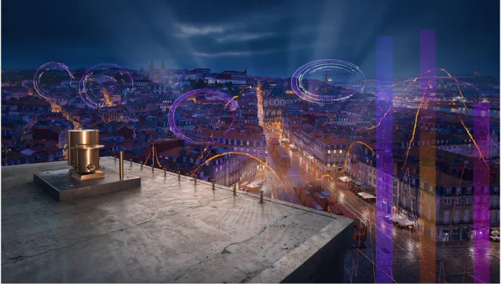
The traditional architectural render is dying. For decades, the industry has relied on “lifestyle” visualizations—static images of sun-drenched plazas and smiling silhouettes. But in the era of the “smart city,” a beautiful image without an analytical spine is a liability. Modern stakeholders no longer ask what a building looks like; they ask how it performs within the city’s metabolic flow. This shift necessitates a move toward urban data visualization, where we treat metadata as a physical building material, layering invisible layers of transit, heat, and human movement into high-fidelity simulations that ground speculative design in cold, hard evidence.
According to recent American Institute of Architects (AIA) sustainability reports, the integration of data-driven performance metrics in the early design phase is the single greatest predictor of a project’s long-term environmental success. By adopting an analytical mapping approach, we align ourselves with the AIA’s Framework for Design Excellence, specifically the principles of “Design for Resources” and “Design for Ecology.”
Nuvira Perspective
At Nuvira Space, we view the city not as a collection of static masses, but as a high-frequency data stream. We believe that the synthesis of human intuition and machine precision is the only way to navigate the complexity of modern urbanism. By leveraging real-time engines and hardware-accelerated ray tracing, we are bridging the gap between digital intent and architectural reality. Our mission is to move beyond the “pretty picture” and produce high-fidelity simulations where every pixel represents a decision-backed metric, allowing designers to visualize the invisible forces that shape our built environment. For an in-depth look at our engine-specific philosophy, explore our breakdown of Unreal Engine 5 for Architecture.
1. Spatio-Temporal Flow: Mapping Rotterdam’s Logistic Pulse
When you visualize a city like Rotterdam, you are visualizing one of the most complex logistical nodes on the planet. Mapping its urban data requires a departure from static splines. The movement of the Port of Rotterdam is a 24/7 variable that influences everything from local noise pollution to real estate value in the city center.
Workflow: Real-Time Vector Fields
To map the flow of the Port of Rotterdam, we abandon traditional “path” animations in favor of vector field simulations within Unreal Engine 5.
- Technical Spec: Utilize Niagara Fluids for 2D cross-section flow simulation.
- Parameter: Set “Voxel Size” to 0.5 for high-resolution turbulence near quay walls.
- Rendering: Use an emissive material with a “Time” node to pulse light along the vector paths, representing 24-hour cargo movement in 60 seconds.
2. Thermal Orthomosaics: The Heat Island Effect
Standard Revit or Rhino models fail to show the thermal impact of material choices. We map the “Urban Heat Island” effect by projecting GIS thermal data onto 3D building envelopes. This is crucial for architects aiming for AIA-compliant “Design for Energy” standards, as it visualizes where the building envelope acts as a radiator rather than an insulator.
Workflow: Texture-Based Displacement
- Software: Houdini to Blender (Cycles).
- Technique: Use Python to scrape OpenWeatherMap API data, converting temperature Kelvin values into a grayscale displacement map.
- GI Setting: In Cycles, set “Max Bounces” for Glossy to 0 to ensure the thermal glow doesn’t create unrealistic bounce light, keeping the analytical focus on the heat source itself.
3. Noise Pollution Topography: Visualizing Soundscapes
Sound is often the most neglected urban data point. We map decibel levels as vertical “spikes” across a city grid. In many of our pedestrian-first city design studies, we use this topography to determine where acoustic baffles or kinetic facades are required.
- The Geometry of Sound: We treat sound as a geometric extrusion rather than a texture. This allows for spatial volume calculations.
- Procedural Extrusion Specs:
- Map DB values to Z-axis extrusion via a procedural noise gate.
- Apply a Gradient Map based on height: 40dB (Deep Blue) to 95dB (Vibrant Crimson).
- Subsurface Scattering (SSS): Set to 0.1 to give the “sound spikes” a physical, semi-translucent weight that simulates sound absorption.
4. Solar Exposure Ray-Casting (Singapore Case Study)
In high-density environments like Singapore, solar access is a legal and environmental necessity. We replace legacy “Sun Studies” with real-time Ray-Traced Ambient Occlusion (RTAO) to see precisely where shadows stifle ventilation.
By leveraging Singapore’s “Smart Nation” data, we import building heights and orientations to calculate exact GHI (Global Horizontal Irradiance). This allows us to simulate the feasibility of urban farming skyscrapers by mapping the minimum threshold of light needed for photosynthesis across a 3D facade.
5. Pedestrian Density Heatmaps: The Path of Least Resistance
Using LiDAR-captured “desire lines,” we map human movement not as icons, but as “erosion” maps. This is particularly effective when designing masterplans for the “15-minute city” model.
- Nuvira Technique: Using a “Distance To” node in the shader editor, we make the pavement texture “wear away” (increase specular roughness and decrease diffuse) in areas of high footfall data. This visualizes the physical impact of crowds on the urban fabric without using clunky crowd-simulation characters.
6. Carbon Sequestration Voxelization: Mapping Green Value
We map the biomass of urban forests using voxel-based volumes. Instead of simple 2D tree plots, we visualize the cubic volume of carbon sequestered by each tree species.
- Technical Spec: Use Houdini VDBs to represent the carbon density “cloud.”
- Value: This provides a clear metric for carbon-offset calculations required for LEED or AIA 2030 Commitment reporting.
7. Real-Time Transit Latency Isochrones
Visualizing connectivity often relies on “as-the-crow-flies” circles. We replace this with dynamic isochrones—complex, undulating polygons that represent “travel time” rather than distance.
- Workflow: Integrate Mapbox API with a custom shader in Unreal Engine that shifts the color spectrum of the city based on the latency of the closest subway or bus line in real-time.
8. Sub-Surface Infrastructure “X-Ray” Views
The city above is only half the story. We map utility lines, fiber optics, and water infrastructure as glowing nervous systems.
- Rendering: Use a “Scene Depth” mask to render building foundations as semi-transparent wireframes, while infrastructure is rendered as high-emissive pipes. This is vital for adaptive reuse projects, such as converting industrial zones into housing.
9. Wind Tunnel Aerodynamics via CFD Integration
Using Computational Fluid Dynamics (CFD), we map wind pressure as a visual velocity field.
- Case Study: We applied this to a high-rise study in Chicago to visualize “canyon effect” wind speeds.
- Visualization: Use “Ribbon Trail” actors in Niagara to show high-velocity air particles wrapping around structural masses.
10. Property Value “Topographic Maps”
We map economic data as a physical terrain. Areas of high market value are extruded upward, creating a “wealth-scape.”
- Objective: To show the correlation between green space and property value spikes, supporting the case for biophilic urban planning.
11. Demographic Connectivity Hubs
Mapping data on age, income, and profession as “force fields.”
- Technique: Use Voronoi partitioning to show the catchment areas of community centers and hospitals, highlighting “service deserts” where infrastructure is lacking.
Nuvira Vs. Industry Standard: A Comparative Analysis
| Feature | Legacy Industry Workflow | Nuvira Disruptive Workflow |
|---|---|---|
| Data Source | Static CAD/PDF files | Real-time API & GIS Integration |
| Light Calculation | Pre-computed “Baked” Lighting | Hardware-Accelerated Lumen/Ray-Tracing |
| Data Fidelity | Illustrative/Approximated | Voxel-perfect/Evidence-based |
| User Interaction | Passive (MP4/JPG) | Active (Real-time Simulation/VR) |
The Death of the “Bake”
The industry standard relies on “baking” lightmaps—a process that freezes data in time. Nuvira utilizes Global Illumination (GI) that reacts to data changes. If we update the “Transit Frequency” variable, the emissive light of the city model updates in real-time. This isn’t just a render; it’s a live dashboard. This philosophy is further explored in our guide to digital twins and smart cities.
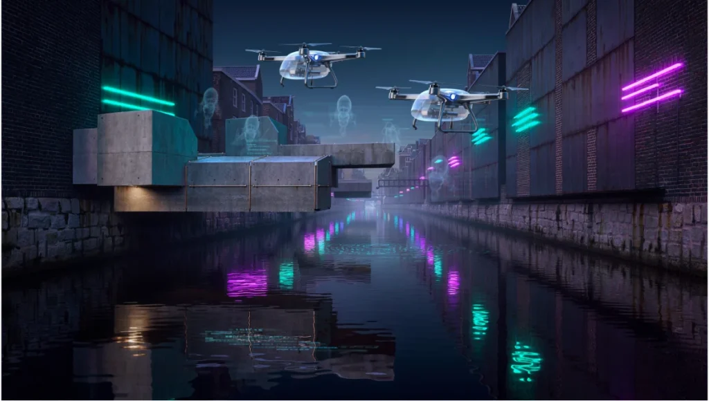
Speculative Concept Project: NEO-CANALIS by Nuvira Space
Project Overview: Amsterdam / Water-Borne Logistics / Post-Automotive Vision
Neo-Canalis is a study on repurposing Amsterdam’s historic waterways for autonomous delivery drones and water-taxis, reducing street-level noise by 40%. Given the rising sea levels, this project also examines the viability of floating cities.
Design Levers Applied
- Fluid Dynamics Simulation: Used to calculate water displacement and wake impact on historic canal foundations.
- Light Path Tracing: Set to 32 bounces to accurately capture the caustic reflections of neon-lit drones on the water surface.
- Technical Spec: 4K texture resolution for all water-level textures to ensure macro-fidelity during low-angle “drone-view” shots.
Transferable Takeaway
By visualizing the “wake” data of drones, we proved that autonomous water transit requires specific “soft” quay wall reinforcements—a detail invisible in a standard architectural model.
Intellectual Honesty: Hardware Check
You cannot run high-fidelity urban simulations on consumer-grade laptops. To achieve the results described:
- GPU: Minimum 24GB VRAM (NVIDIA RTX 4090 or A6000). Data-heavy textures will crash 8GB-12GB cards.
- RAM: 128GB DDR5. Handling the PLUTO database or OpenStreetMap geometry for a whole city requires massive memory overhead.
- Storage: NVMe Gen4 SSD. Real-time streaming of high-resolution textures requires 7,000MB/s read speeds.
2030 Future Projection: The Digital Twin Autonomy
By 2030, urban data visualization will transition into Predictive Digital Twins. We won’t just map current data; we will use Generative Adversarial Networks (GANs) to simulate 50 years of urban decay, material weathering, and shifting climate zones. The “Render” will be a living, breathing software instance that evolves alongside the city it represents. The AIA is already moving toward requiring “Continuous Performance Modeling” for large-scale institutional projects, making this skill set mandatory for the next generation of designers.
Secret Techniques: Advanced User Guide
Sub-Pixel Jittering for Micro-Detail
When rendering massive cityscapes, moiré patterns often ruin the “fineness” of the mesh.
- Fix: In your Post-Process Volume, set “Anti-Aliasing Method” to TSR (Temporal Super Resolution) and increase the “Screen Percentage” to 150%. This downsamples a higher resolution to your target frame, eliminating pixel crawl on distant skyscrapers.
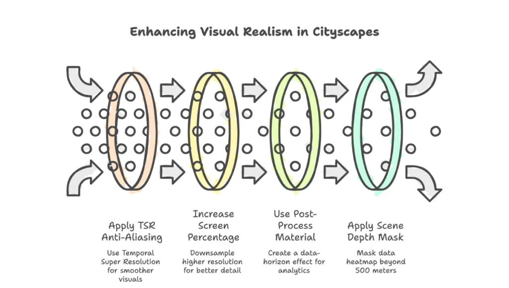
Overriding Global Illumination for Analytics
If the “Atmospheric Fog” is washing out your data colors:
- Fix: Use a “Post-Process Material” with a “Scene Depth” mask. Apply your data heatmap to everything beyond 500 meters, while keeping the immediate architectural foreground photorealistic. This creates a “Data-Horizon” effect that looks intentional and high-end.
Comprehensive Technical FAQ
Q: Why use Unreal Engine over traditional V-Ray for urban mapping?
A: V-Ray is superior for static interiors, but for urban data visualization, the ability to walk through a dataset at 60fps is non-negotiable for client communication. Unreal’s Nanite geometry system allows us to import millions of city buildings without performance loss.
Q: Does the AIA accept data-viz as part of official documentation?
A: Increasingly, yes. While 2D blueprints remain the legal standard, the AIA’s Integrated Project Delivery (IPD) model encourages the use of BIM and data-simulations to mitigate risk and verify performance targets before construction begins.
Q: How do you handle “Z-fighting” in large city models?
A: We use a procedural “Push” modifier in Houdini to offset overlapping faces by 0.001mm based on their “Normal” direction before export.
Q: What is the best way to represent “invisible” data like Wi-Fi signals?
A: Volumetric Fog. By mapping signal strength to “Fog Density” and “Albedo,” you can create a literal “cloud” of connectivity that users can fly through.
Join the Nuvira Visual Lab
The era of the uninformed architect is over. If you are ready to stop “drawing” and start “simulating,” explore our advanced technical archives at Nuvira Space. Challenge your workflow. Master the machine. Visualize the future.