

Table of Contents
Dopamine decor replacing beige minimalism 2026 is not a color trend you are watching from a distance — it is a shift in what your nervous system is asked to process every time you walk through your own front door.
Nuvira Perspective
At Nuvira Space, we treat the home as a health machine, not a mood board. The evolution underway right now — dopamine decor replacing beige minimalism 2026 — is best understood as an adjustment in the operating instructions we give our own biology. For roughly a decade, the dominant domestic language was one of suppression: greige walls, muted textiles, and an almost clinical restraint that was marketed as calm but often produced under-stimulation instead.
Under-stimulated environments do not soothe the nervous system; they starve it of the sensory variety it evolved to expect, and the body responds by seeking stimulation elsewhere, usually through screens, snacking, or restless scrolling that has nothing to do with the room itself and everything to do with what the room failed to provide.
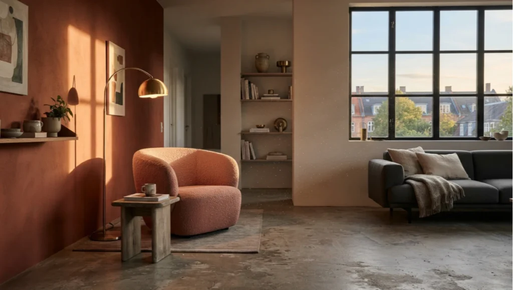
Modular adaptability and circadian synchronization define the next era of domestic life because they replace static aesthetic decisions with living systems. A wall no longer has to choose between beige and coral forever — it can shift, respond, and resynchronize with a resident’s actual physiology across the day. This is the macro-environmental shift Nuvira Space has spent the last cycle mapping: color, light, and texture treated as inputs to a regulatory system, not as finishes chosen once and lived with indefinitely.
This reframing matters because it changes who gets to claim expertise over a home’s interior. For years, the loudest voices in residential design were stylists and photographers, and the metric of success was how a room performed on a feed. Nuvira Space’s position is that the metric of success should be how a room performs on a nervous system — whether it helps a resident wake up alert, work with focus, unwind without artificial sedatives, and sleep on schedule. Dopamine decor, in this frame, is not indulgence. It is closer to a corrective, restoring signal variety that clinical-feeling minimalism had quietly stripped out under the banner of good taste.
None of this requires abandoning restraint entirely. The opposite of beige minimalism is not clutter; it is precision. A well-executed dopamine interior is often more disciplined than the neutral rooms it replaces, because every saturated surface, every warm-toned fixture, and every textured object is placed with a specific physiological outcome in mind, rather than as decoration for its own sake.
Technical Deep Dive
Understanding why saturated, high-contrast interiors are displacing beige minimalism requires moving past preference and into the physiology of color and light exposure. Three mechanisms do most of the work: color as a neurochemical signal, texture as a regulator of tactile load, and lighting infrastructure that can actually shift its output across a day rather than staying fixed at a single, compromise setting. Each of these mechanisms is well documented individually in lighting-design and occupational-health literature; what Nuvira Space’s work focuses on is how they interact once combined in a single residential unit, rather than treating each as an isolated specification.
Color as a Neurochemical Signal
Color is processed by the retina and relayed through the retinohypothalamic tract to the suprachiasmatic nucleus — the same circuit responsible for circadian timing. Saturated, warm hues in the 500–620 nanometer range have been associated in lighting-physiology research with measurable increases in subjective alertness and mild elevations in dopaminergic reward signaling, particularly when paired with morning light exposure.
Beige and low-chroma palettes, by contrast, sit in a narrow reflectance band that produces almost no differentiated signal for the visual cortex to register, which is part of why occupants of very neutral rooms frequently describe them as ‘restful’ and ‘draining’ in the same sentence. The nervous system is not being calmed in a beige room; it is simply being given less to work with, and the felt sense of fatigue is often mistaken for tranquility.
This is why a purely aesthetic reading of the shift misses the point. Dopamine decor replacing beige minimalism 2026 is not about chasing a brighter palette for its own sake — it is about restoring a level of chromatic variance the eye and brain were built to expect from a natural environment, where color shifts constantly with time of day, weather, and season. A domestic interior that never changes color is, in a very literal sense, an environment with the seasons switched off.
It is worth noting that saturation alone is not the variable that matters most; it is the relationship between saturation and context. A single deep terracotta wall read against warm, tunable light behaves very differently from the same wall lit by a flat, unchanging fluorescent-equivalent bulb. Color specification without a corresponding lighting specification is therefore an incomplete brief, and one of the most common mistakes in early attempts at dopamine decor is treating paint choice as the entire intervention rather than one half of a paired system.
- Chroma range 40–70 (Munsell): associated with heightened but non-overstimulating visual engagement
- Warm-hue accents concentrated in social zones increase dwell time in shared rooms
- Cool, desaturated tones reserved for sleep zones support melatonin onset
- Full-spectrum LED fixtures allow chroma shifts of up to 3000K across a single day cycle
For a deeper breakdown of hue selection and chroma pairing at a room level, see Nuvira Space’s color theory interior design guide.
Texture Load and Tactile Regulation
Surface Variance as Sensory Nutrition
A second, less discussed driver behind dopamine decor replacing beige minimalism 2026 is tactile variance. Minimalist interiors frequently flatten texture alongside color, producing surfaces that are visually and physically uniform. Occupational therapists working in sensory regulation have long used textured surface variety — bouclé, ribbed ceramics, brushed metal, nubby wool — as a grounding tool for the nervous system. Reintroducing this variety at a domestic scale is not decorative excess; it is closer to restoring a sensory input that was quietly removed during the era of hard, flat, single-material rooms.
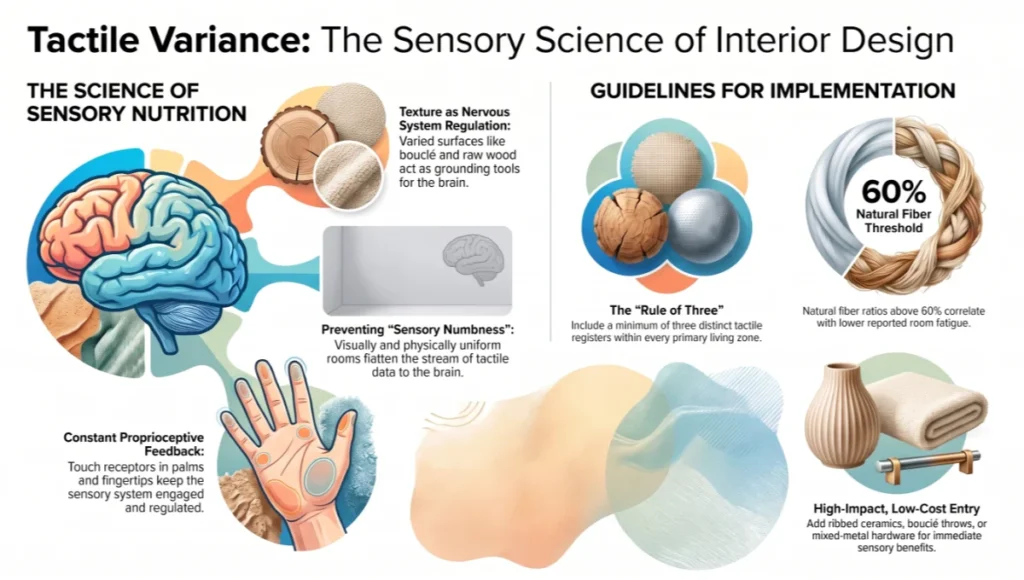
The mechanism is straightforward. Touch receptors in the skin, particularly the fingertips and palms, provide a constant low-level stream of proprioceptive and tactile data to the brain. When every surface in a room shares the same texture — smooth painted drywall, matte quartz, unadorned linen — that stream flattens along with the room. Reintroducing three or four distinct tactile registers per zone gives the hand something to differentiate, which in turn keeps the broader sensory system in a more engaged, regulated state rather than a passively numbed one.
This is also why texture, unlike color, is comparatively cheap to introduce as an early step. A household testing the dopamine-decor approach for the first time can add a bouclé throw, a ribbed ceramic vase, and a raw-edge wood object to a single room for a fraction of the cost of a lighting retrofit, and evaluate whether the tactile-variance effect is noticeable before committing to the larger electrical work that full circadian control requires.
- Minimum 3 distinct tactile surfaces per primary living zone
- Layered textiles reduce reliance on visual stimulation alone
- Natural fiber ratio above 60% correlates with lower reported room fatigue
- Mixed-finish hardware (matte plus brushed metal) adds tactile contrast at contact points
This same tactile-regulation logic is the foundation of Nuvira Space’s sensory rooms in residential design, where surface variety is engineered rather than decorative.
Circadian Lighting Infrastructure
None of this works without lighting infrastructure that can actually shift across the day. A dopamine-forward interior without tunable lighting is simply a brighter version of the same static problem beige minimalism had. Nuvira Space’s technical position is that color strategy and lighting strategy must be engineered together, not layered afterward, because color read under a single fixed color temperature will always feel one-dimensional no matter how saturated the paint or textile choices are.
In practice, this means specifying tunable-white or full-spectrum fixtures at the point of build or retrofit, rather than treating lighting as an accessory chosen after the palette is finalized. The lighting system effectively becomes the conductor for how the room’s colors and textures are perceived at any given hour — the same terracotta accent wall can read as energizing at 9 a.m. under a cool-neutral bias and as calming at 9 p.m. under a warm 2200K wash, without a single paint change.
Automation matters here as much as range. A household that must manually adjust a dimmer or color-temperature dial at three points in the day will, in practice, do it inconsistently or not at all, which is why the more resilient version of this infrastructure ties lighting phase to time of day through a scheduled controller rather than relying on resident memory. The goal is a system that defaults to the correct behavior, with manual override available but not required.
- Morning phase: 4000–5000K, high intensity, cool-warm neutral bias
- Midday phase: 3500–4000K, full task illumination
- Evening phase: 2200–2700K, warm bias, dimmed to under 30% max lumens
- Automated transitions reduce manual override errors by removing decision fatigue
A full technical breakdown of the fixtures and controls involved is available in Nuvira Space’s guide to circadian lighting systems.
Comparative Analysis
The clearest way to evaluate this shift is side by side, against the industry default that has shaped residential interiors since the early 2010s. The comparison below is not a matter of taste preference — it reflects two fundamentally different design philosophies: one optimized for photographic consistency, the other optimized for occupant physiology across a full day.
Nuvira Solution vs. Industry Standard
| Aspect | Industry Standard | Nuvira Solution |
| Color strategy | Fixed, low-chroma palette across all rooms | Zone-specific chroma mapped to function and time of day |
| Lighting | Static color temperature, single dimmer curve | Tunable 2200K–5000K circadian curve, automated |
| Texture | Uniform surface finish, minimal tactile variety | Minimum 3 tactile registers per primary zone |
| Design intent | Photographs well, ages neutrally | Regulates occupant physiology across a 24-hour cycle |
| Adaptability | Renovation required to change mood | Modular panels and lighting allow same-day reconfiguration |
| Maintenance model | Static palette locked at move-in | Programmable presets updated as household needs change |
The industry standard was never wrong about calm — it was incomplete about how calm is actually produced. Nuvira’s position treats calm as a state you arrive at through regulation, not one you impose through the absence of color. A truly restful room, by this definition, is one that actively helps a nervous system downshift in the evening, not one that simply avoids offending the eye at any hour.
This distinction also explains why some occupants of beige-minimalist homes report feeling flat rather than calm after extended periods of residence. A regulation-first model predicts this outcome directly: a room that never varies its sensory input has nothing to help a nervous system transition between states, whereas a zoned, time-aware interior gives the body clear cues for when to be alert and when to stand down.
Concept Project Spotlight
Speculative / Internal Concept Study — Project Solhus by Nuvira Space
Project Overview
Location: Copenhagen, Denmark
Typology: Retrofit of a 1960s three-story residential block into eight circadian-tuned apartments
Vision: to test whether a northern-latitude city with extreme seasonal light variance could use dopamine-forward interior strategy to offset winter under-stimulation, without abandoning the material restraint Danish design is known for
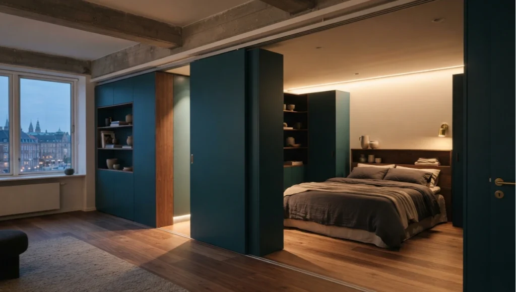
Copenhagen was selected specifically because its winter daylight window can fall below seven hours, creating one of the more demanding real-world tests available for circadian-responsive interior systems. If tunable color and lighting infrastructure can maintain occupant alertness and mood regulation through a Copenhagen winter, the same logic scales easily to milder climates. The city’s existing design culture — restrained, materials-forward, historically wary of bright color — also made it a useful stress test for whether dopamine strategy could be layered onto a Scandinavian sensibility without producing visual noise.
The retrofit approach was deliberately conservative on the building envelope and aggressive on the interior systems: existing masonry, window openings, and structural layout were preserved, while lighting circuitry, modular wall panels, and zone-specific material palettes were treated as the primary intervention. This kept the project financially comparable to a standard residential upgrade rather than a full architectural overhaul, and made the resulting cost data more directly useful to residents considering a similar retrofit on an existing building rather than new construction.
Design Levers Applied
Zone-by-Zone Interventions
Each unit in Project Solhus was divided into three functional zones, each carrying a distinct chroma and lighting profile rather than a single whole-apartment palette. This zoning discipline is what separates the project from a simple ‘add color’ renovation — every material decision maps back to a specific time-of-day function.
- Entry and kitchen zone: terracotta and ochre accent panels, 4000K morning-biased lighting
- Living zone: modular felt and bouclé seating in muted coral, tunable 2700–4000K track
- Sleep zone: deep teal and warm timber, capped at 2200K after 20:00 local time
- Shared stairwell: full-spectrum skylight diffusion panel to extend perceived daylight hours
A secondary lever, less visible but structurally important, was modularity itself. Wall panels in the living zone were designed to be swapped seasonally — a resident could shift from a warmer autumn palette to a cooler spring one without repainting, using a rail-and-panel system that took under twenty minutes per wall. This turned what would normally be a multi-week renovation decision into a same-afternoon adjustment, which is the practical expression of ‘modular adaptability’ at a resident level rather than a marketing abstraction. The panel system also allowed Nuvira Space’s team to gather before-and-after feedback from the same residents across two seasonal changes, rather than relying on a single fixed installation.
Transferable Takeaway
You can apply the same logic at home by tuning evening lighting, building a refuge corner, and simplifying one primary sightline toward a natural anchor.
None of the three actions above require the modular panel system used in Project Solhus. A refuge corner can be a single armchair positioned away from a doorway sightline with a warm-toned lamp nearby; simplifying a sightline can mean removing visual clutter between a seating position and a window rather than adding anything new. The Copenhagen project scaled these same principles to eight units, but the underlying logic was deliberately kept simple enough to translate to a single room in an existing home.
Intellectual Honesty: Current Limitations
It would be dishonest to present dopamine decor replacing beige minimalism 2026 as a fully solved problem. Tunable lighting infrastructure remains a meaningful upfront cost in retrofit contexts, and not every rental or older building can accommodate the wiring changes required for full circadian control. Saturated color also carries real risk of overstimulation when applied without zoning discipline — a common failure mode is treating every room the same way a showroom treats a single accent wall, which produces visual fatigue rather than regulation.
There is, additionally, a shortage of long-term longitudinal data; most of the physiological associations cited above come from lighting-science and occupational-therapy research conducted in controlled settings, not multi-year residential studies. Household composition also complicates any universal prescription — a household with young children, a shift worker, or a resident with a diagnosed sensory processing condition will need a meaningfully different zoning strategy than the general framework described here. Nuvira Space treats this as an active research area, not a closed case, and continues to track occupant feedback from Project Solhus as one input among several, alongside published literature as it becomes available.
For an independent, non-Nuvira reference point on daylight and well-being outcomes, the AIA Framework for Design Excellence — Well-Being outlines comparable evidence at an industry-wide level.
2030 Future Projection
By 2030, the reasonable expectation is that circadian lighting infrastructure moves from a premium retrofit feature to a standard inclusion in new residential construction, in the same way structured cabling and smart thermostats did in the prior decade. Color strategy will likely become zone-programmable through the same interface controlling lighting, allowing wall-integrated e-textile or photochromic panels to shift chroma without a repaint.
The more interesting projection is behavioral: as occupants gain daily feedback on how their environment affects mood and alertness, decor decisions will increasingly be evaluated the way nutrition or sleep hygiene are evaluated today — as a discipline with measurable inputs, not a matter of taste alone. It is plausible that by the end of the decade, residential listings will begin to disclose lighting and chroma specifications the way they currently disclose square footage and energy ratings, particularly in markets already primed by wellness-real-estate marketing.
Cities with strong existing wellness-design cultures, alongside northern-latitude cities that share Copenhagen’s seasonal light challenge, are the most likely early adopters of this disclosure norm.
Actionable Design Principles
The following principles distill the technical sections above into a sequence a household can act on without hiring a full design team, ordered roughly by cost and complexity so that the least expensive, highest-impact changes come first.
- Zone your palette by function, not by whole-home consistency
- Install tunable white lighting before investing in saturated furniture
- Cap evening color temperature at or below 2700K in sleep-adjacent zones
- Introduce at least three distinct tactile surfaces per shared living zone
- Anchor one sightline in every room toward a natural element — a plant, a window, a wood grain surface
- Treat any single very saturated wall as a zone marker, not a decorative afterthought
- Budget lighting infrastructure before furniture when planning a phased renovation
Comprehensive Technical FAQ
The questions below come from the specific technical decisions households and renovators most often get stuck on when translating the framework above into a real apartment or house, rather than general curiosity about the trend.
Q: Is dopamine decor the same as maximalism?
A: No. Maximalism is defined by density and pattern layering. Dopamine decor replacing beige minimalism 2026 is defined by targeted chroma and light exposure mapped to physiological zones — it can exist in a sparse room, provided the color and lighting logic is intact.
- Maximalism: pattern density
- Dopamine decor: chroma and light zoning
- Overlap possible, not required
Q: What lighting temperature range should a home lighting retrofit target?
A: A residential circadian retrofit typically spans 2200K to 5000K across a single fixture set, with automated transitions rather than manual switching.
- 2200–2700K: evening and sleep-adjacent zones
- 3500–4000K: daytime task zones
- 4000–5000K: morning-biased entry and kitchen zones
Q: Does this approach work in rental apartments without rewiring?
A: Partially. Freestanding tunable lamps and modular textile layering can replicate a meaningful portion of the zoning logic without altering fixed wiring, though full automation requires infrastructure changes. Many renters achieve a workable approximation by combining plug-in smart bulbs on a schedule with removable wall panels or large-format textiles that can be taken down at move-out without penalty.
- Freestanding tunable lamps in place of fixed circadian wiring
- Removable textured textiles for tactile zoning
- Full automation still requires an electrician-installed system
Q: How many colors should a single room realistically carry?
A: Two to three dominant hues per functional zone is the practical ceiling before visual fatigue outweighs stimulation benefit, based on the zoning pattern used in Project Solhus.
Q: Is there a risk of overstimulation for sensitive occupants?
A: Yes, which is why zoning discipline matters more than color intensity. Sleep-adjacent zones should stay desaturated and warm-capped regardless of how bold the social zones are, and any household with a sensory-sensitive occupant should treat chroma as a variable to titrate slowly rather than apply uniformly. A practical starting test is to introduce one saturated element at a time and observe the household’s response over several days before adding another.
Begin the Shift in Your Own Rooms
Dopamine decor replacing beige minimalism 2026 will not require a full renovation to test. Start with the room you spend your evening hours in, cap its lighting at a warmer temperature after sunset, and introduce one saturated tactile object — a throw, a ceramic, a piece of reclaimed wood — into your direct sightline. Track how the room feels across a week before adding a second zone. Nuvira Space will continue tracking this shift as circadian infrastructure becomes standard rather than premium, and as more cities beyond Copenhagen become case studies in their own right.
If you are planning a larger renovation, sequence the work so that lighting infrastructure is specified before finish materials are chosen, since the lighting plan determines how every subsequent color and texture decision will actually read once the room is lived in rather than staged for a single photograph.
© Nuvira Space — All rights reserved. | LIVING SPACES Series | All specifications cited are based on lighting-physiology and occupational-therapy research referenced in industry literature. Project Solhus is a speculative internal concept study and does not represent a completed project.